From Ignored to Indispensable: The Proven, Step-by-Step CX Insights Mastery Blueprint in < 6 Days! Get free access>


Last month, I had the pleasure to speak with Jeff Toister (CPLP, Author of “The Service Culture Handbook”) on his webinar on how to improve customer service with unstructured data.
Contact centers often miss out on many opportunities on how to improve their team’s performance and deliver critical insights to the rest of the company, simply because the analysis of mountains of data they collect may seem daunting. As a result, strategic decisions are based on assumptions instead of data. Also, progress is tracked at an aggregate level without a clear understanding of what works and what doesn’t.
Let’s look at does unstructured data actually include, how does one approach the analysis to ultimately improve customer service. We’ll cover:
Unstructured data is data that isn’t stored in a fixed record length format. In a contact center, examples can be survey comments, email, social media posts, chat transcripts, call recordings, quite a lot of different types of data. The volumes, variety, and noisiness can be overwhelming.
When speaking to our customers, we typically explore why they want to use unstructured data. People may have assumptions about what is going well or not so well, and they want to back these assumptions by data. But ultimately, they want to find areas of improvement, which they can focus on, or track whether their actions are making a difference over time.
When it comes to satisfaction and loyalty surveys, businesses also want to use unstructured data to answer why their score dropped or went up in a particular month and what they can do to improve it. Unstructured data collected through contact centers is also often used to train customer service agents, for example, to evaluate types of responses from agents.
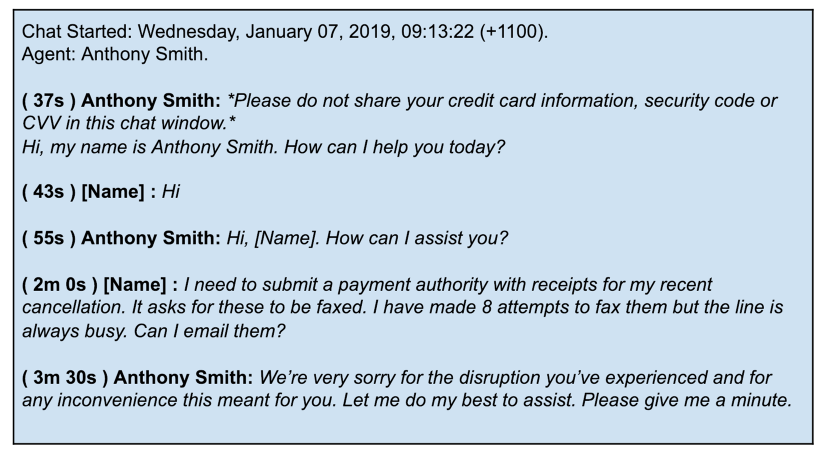
Here is a real-life example of a typical conversation in a contact center (in 2019!). You can see immediately that it has some profound insights into an outdated process that is painful and must be updated:
Contact centers sit on a mine of data that can drive significant improvements to their businesses:
Most contact center managers already train their employees on how to be polite or how to handle angry customers. But insights from unstructured data can help understand what are the most common queries, concerns, and situations. Knowing in depth why customers and prospects contact you can help create repeatable processes in how to support them effectively.
As businesses work on their products and processes, deep understanding of what works and what doesn’t can only come through monitoring the specific types of inquiries and how customer feedback changes over time.
Ultimately, insights into customer’s biggest pain points, their importance, and taking the actions to resolve these pain points will lead to increased customer lifetime value and better retention metrics.
Even now, we are still seeing that the majority of companies don’t take advantage of their data and strategic decisions are based off anecdotes and assumptions.
Let’s look at the process of analyzing unstructured data.
First things first – you need to clean your data and find the part of conversation or feedback that is actually useful for you. In the example above, it means extracting the following part.

A simple way of detecting the customer query is to look at what was the second thing that the customer said after a greeting such as “hi”.
Then we need to detect themes in the relevant comments. A theme is a combination of words that have a specific meaning. For example, themes in this example would be:

The important part of this step is to detect themes regardless of how two different people might be saying the same thing. One person might say “can I email”, another might say “is it possible to email” or “what is your email”.
You need to take into account synonyms and paraphrases. The longer the theme the more variations are there, which is why ultimately you will need software to do the analysis. But, you can always start with a basic set of themes.
Please note that just using the word “email” might match phrases that have a different meaning, such as “I sent you an email and you didn’t respond”, so while we suggest using this word matching technique below, it will need some manual refinements. At Thematic, our AI algorithms discover multi-word themes on their own, so that this can be avoided.
Next, we need to group themes into a hierarchy to make it easier to manage. For example, you could create “contact methods” group, and group “email” and “fax” under it.
Once all unstructured data is cleaned, themes are discovered, grouped and verified, you will want to run a volume and impact analysis, which will help you answer questions such as What are the most common themes? Which themes are impacting our high and low satisfaction scores the most? Below we explain how to do this using some simple in-house techniques.
You can use a spreadsheet to manually tag pieces of unstructured data using its in-built formulas. For example, this formula uses full-text search and will return TRUE, if the feedback stored in cell A1 contains the word “email”:
![]()
Therefore, you can use it in an IF/THEN formula to tag text with various categories.
Here is an example of the full formula that categorizes text into Billing, Price, and Ease of Use:

Download here a sample spreadsheet, where you can insert your data instead of sample one and extend the tagging as required.
You need to make sure the analysis is done correctly. For example, you can review the results and manually correct fields that were tagged incorrectly.

Don’t spend too much time on this, just try to get a sense of what people talk about the most. If you see a theme that looks interesting you can repeat it in the next column and categorize it into more specific sub-themes.
Now that you have all comments themed you can look at the overall volume of responses and start slicing the data. For example, you can compare the distribution of themes among recent and old customers, or compare your top performing agents vs the worst performing ones.
Make sure to review all comments that haven’t been categorized. It’s always interesting to learn which data doesn’t fall into any of the categories you already knew existed in your data. Sometimes, it can reveal emerging issues, as shown in the next section.
We worked with a TV network provider which shared with us their contact center data over a period of many months. Usually, the themes were always very similar: it was either that the service was too expensive, or that they aired too many repeats of shows, or had complaints about customer service.
However, among the comments that didn’t fall into pre-existing categories Thematic’s algorithms detected an emerging theme, which they never would have expected otherwise.
What had happened was that they changed their user interface but didn’t test whether their viewers could see their program guide on all types of TVs. It turned out that a lot of customers who were not using the latest flat screen TVs were not able to change the program. This insight helped them to quickly alert the product team by just how important that issue was.
Jeff Toister spoke of the “iceberg technique” that is particularly useful when looking at unexpected themes. Even one piece of unstructured data can uncover a problem that is bigger beneath the surface. He gave an example, an email came through, which said:

“If you get this from one customer, chances are that other customers can be experiencing the same! When I looked into it, this person had tried to sign up via email, but the date of sign up was set to 1969 for some reason in the system, which was really strange.”
Jeff went back and forth with technical support and found that there’s a setting on my end that made it hard for certain companies to allow email to come through. And when he fixed that setting, his weekly subscriber growth had nearly doubled.
The moral of the story? Many other people had the same issue but only one person had bothered to send an email. When something doesn’t make sense, investigate it, and you might discover a big problem that can be fixed with a simple solution. A single piece of feedback can identify an emerging problem.
If you have a score associated with a piece of unstructured data (this could be CSAT or NPS) you can use this technique to understand not just what the most commonly discussed issues are but also how they impact that score.
Imagine if a negative theme was never mentioned in responses. What would be your score then? The difference between the overall score and the score excluding the selected theme is the impact of that theme on that score.
For example, if you send a transactional NPS survey after each interaction with your contact center, you could calculate NPS and the impact of a specific theme, such as “fax doesn’t work” as following:
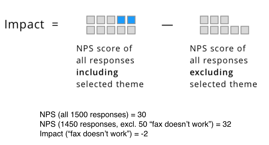
Our spreadsheet with a formula that tags NPS comments, also contains examples of how to calculate the impact of themes in that sample data. The results can be charted as follows: 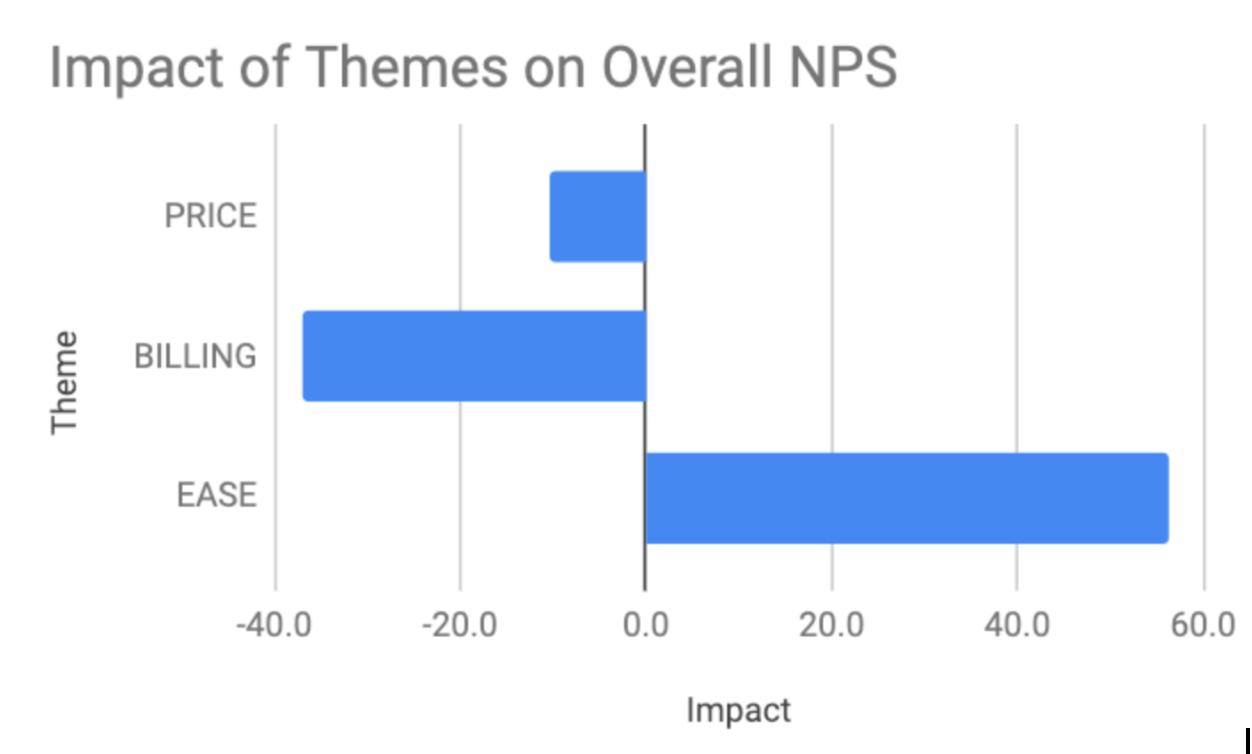
While this is a small sample of only 13 pieces of feedback, it’s immediately summarized in a way that demonstrates which area of improvements one should focus on. This is really powerful!
In Thematic, these calculations (and many more) are built-in. Let us know if you’d like to see a demo!
We worked with a telecommunications provider whose goal was to increase their NPS. Their initial assumption was to invest in training of their contact center staff: the people need to be friendlier on the phone and so on.
By analyzing themes in customer’s feedback and using the impact tool we could show that actually, their staff was described as helpful, friendly, efficient and knowledgeable. The majority of staff comments had a positive impact on their NPS.
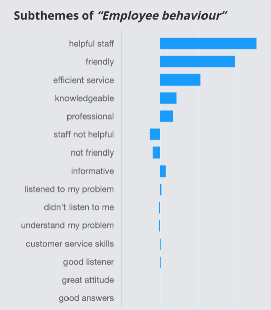
We also discovered specific themes about existing processes (e.g. updating customer credit cards) that had a negative impact and this data was instrumental in focusing the company on the right things that need fixing.
They also now had the data showing that their existing staff training methods worked well and they needed to continue there as before.
Of course, once you can measure the impact of a theme overall, you can also track its impact over time.
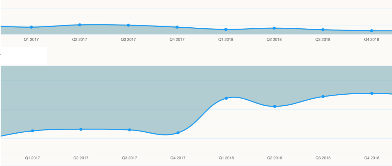
Here, we can see that the volume of a problematic theme decreased slightly but the real change happened in the impact of that theme. As they worked on this issue from Q4 to Q1 they saw a significant improvement in the impact of this issue.
The overall result? They saw double digits improvements to their NPS in just a few months!
Having the data means you can drive change where it’s really needed.
The impact formula we discussed above also works on other metrics, such as financials. For example, you can tag each customer with how much they spend with you each year. By comparing the differences between overall results vs. those excluding specific themes, you can show interesting financial statistics.
We worked with one company whose contact center received feedback about account managers, pricing, shipping and stock of the goods they sold. Overall, each customer spent $1,500 per year with that company. However, those who mentioned what a great Account Manager they had, spent $1,640 per year. Therefore, we could calculate the impact of having a great account manager at $140 per year.
Similarly, those customers who talked about stock and shipping issues spent less. Overall, the impact of broad categories on spent looked as following:
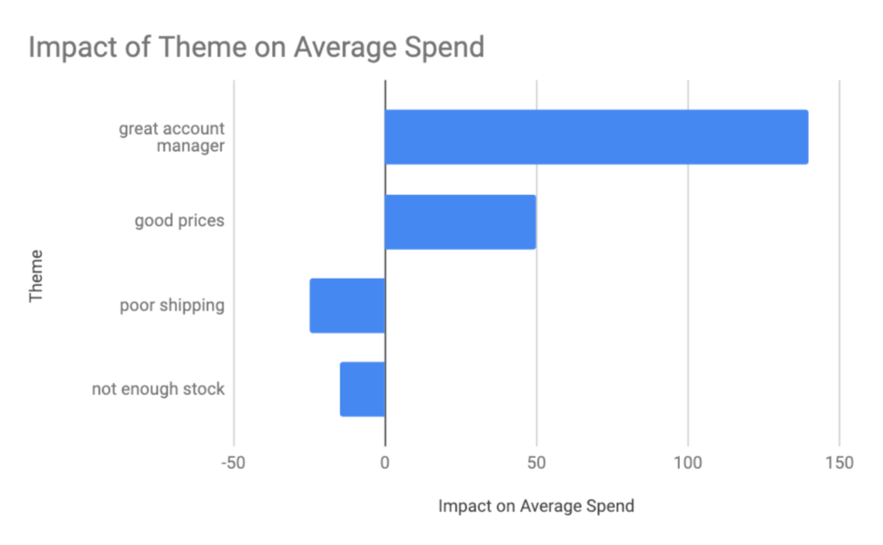
Given these numbers, we can calculate a potential improvement in financial metrics as follows. Imagine if all 5000 customers had an amazing experience with their account managers and spent $140 per year more? It’s a total amount of $700,000 per year that the company might be missing out on.
This number enables you to calculate the potential ROI on activities related to training staff and hiring better account managers.
Similarly, if we look at the price, people who talk about good prices, spent $50 more on average.
If you’re thinking of increasing the prices of your products, you can calculate the amount of money “at risk”. Let’s say that the percentage of people who talked about “good pricing” is 10% across everyone who left feedback. That would be 500 of your customers who spend $1550 per year, or an estimate of $775,000 across all customers.
At Thematic, we always cross-correlate themes in unstructured data with spend and churn data. Having this data means that we can predict what can happen in the future and paint a picture of what financial outcomes the company might be missing out on by not acting on what customers are saying. I hope that this overview of simple but effective tools will also give you the ammunition required to support the stories you are telling in your organizations.
Thematic turns fragmented feedback into one consistent source of customer truth — so every team acts on the same customer story. Up and running in days, not quarters.
Transforming customer feedback with AI holds immense potential, but many organizations stumble into unexpected challenges.