Here, we’ll give some examples of how to tell the story of your VOC compellingly to your stakeholders that you are trying to influence, to ensure you have a successful VOC programme.
This is part 3 of our blog series from our webinar “5 practical ways to influence managers for Voice of Customer (VOC) success”, by myself and Dr. Alyona Medelyan. For the background story, check out the first post here and the second post here. This blog series is all about how to make a strong case internally in your business to get buy-in from your stakeholders for your Voice of Customer (VOC) programme.
What to look for in your VOC data
When you are analyzing your VOC data, you’re looking for the so-called outliers’ connections and characterizations. To get buy-in, your aim is to characterize your data financially and in the same language that your stakeholders’ use. Use their terminology and talk about impact and outcomes in the terms and metrics that matter the most to them.
In any analysis, you want to look for patterns within the customer data itself. In the image below, you can see we’ve got a cross-tab chart on the left-hand side.
The most common and the most simple thing that people use is a top box vs. bottom box. However, using cross-tabs is really useful because you can take the answers to one question on the left-hand side and the answers to another question on the top and compare them. I’m always looking for where the smallest number is.
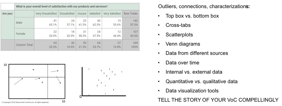
Where’s the smallest and the largest score?
Analyze your data and look for the smallest and largest score and check if that might mean anything. By looking at all of your VOC questions this way you can start to put things together that perhaps wouldn’t have been obvious by just looking at traditional dashboards.
I like “scatterplots” because you can easily see if there are certain outliers in one particular spot. You might want to evaluate those and dig further to see what’s going on with that data.
With regards to Venn diagrams, when you have two circles with a bit of an overlap area, you can use that for where you are finding comments, or a commonality, between two groups and see what is not common.
Compare data from different sources to gain insights
In an ideal scenario, you’re analyzing data from different sources. For example, you might have a customer advisory board, a transaction survey, and other sources of insights. When we put them side by side, certain questions may arise that have a sequential nature in the actual customer journey. So, you’re able to find insights that you wouldn’t have noticed otherwise. This is a great way for managers in your company to see insights that can help them decide how they can run their business smarter.
Looking at data over time, it’s important to look for trends and compare your internal data both with regards to what’s going on in your operations and what’s going on with the customer behavior versus external data such as customer opinions and review ratings.
The best thing you can do is stepping back from your desk and looking at the whole business from a customer’s viewpoint. Think: if you were a customer, what would be significant to you? Or, what’s really meaningful in the big scope of things of how the business runs?
Spend time with senior managers to understand challenges
Sometimes it’s helpful to spend a little bit of time with higher-level managers in your company to try to get a sense of where any barriers might be. Often, you can just get an understanding of this over time, with experience, but talking to stakeholders face to face gives you the best insights – and much quicker. Anything that is a “high” or a “low” needs to be taken into a broader context, and if you look at the full picture you can start to understand which one you should ignore.
Of course, there are a number of data visualization tools on the market that can help to identify various patterns in your data that can tell a story. 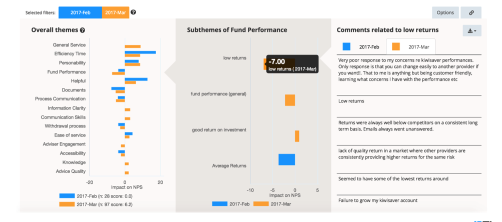
As an example, let’s take this dataset from Thematic. In the image above, we can see Fund Performance data from February 2017 and compare it to data from March 2017. The blue bars are February data and the orange bars are March data. What happened is that the score went up from being 0 in February (let’s say it’s an NPS score) and in March it went up and now 6.2 is shown at the very bottom of the chart.
In the survey which this data is pulled from, as a part of the voice of the customer program for this particular company, they’ve asked: “why did you give us this score”? So, Thematic focused on themes such as “efficiency”, “time”, “personability”, “information clarity” and so on.
Calculate impact by themes
For every single theme in customers were saying, Thematic then calculated what the NPS is of the people who mentioned this particular theme in their response. And by taking into account the number of people who had this particular theme, Thematic was able to calculate the actual impact. What we can see here is lower returns, something that was dragging the score down in March by minus 7 points.
This is something that people did not mention in February. But on the other hand, they did mention “documents” as you can see the “documents” blue bar is more negative, almost an impact of 10 points on the NPS. This is what potentially would have caused the 0, a lower score than in March.
It usually would take you quite a long time to uncover something like this through old-fashioned methods, but as you can see, Thematic is able to uncover this easily. It turns your free text customer responses into themes by using AI-driven text analytics.
Even today, customer comments are so valuable and but so underutilized, and it was almost impossible before we had technologies like this to make full use of them.


.jpg)
.jpg)


