From Ignored to Indispensable: The Proven, Step-by-Step CX Insights Mastery Blueprint in < 6 Days! Get free access>

.webp)
If you've ever stared at an Excel sheet filled with thousands of rows of survey data and not known what to do, you're not alone.
Surveys are only valuable when they actually deliver useful insights. And that's where survey analysis comes in.
Survey analysis tells you what your customers want and how they feel about your product or service. It also helps you track how that changes over time.
In this article we'll look at the best ways to analyze your survey data and how you can use AI-powered tools to make the job easier. We'll also explore survey design and how you can hone your surveys for better responses.
Survey analysis refers to the process of analyzing survey responses. These could include customer surveys, NPS (Net Promoter Score) surveys, or employee surveys.
The aim is to convert raw data into insights you can act on. For example, survey responses might bring up product issues you weren't aware of. You can then take action to fix these problems.
Your surveys will probably generate several different types of data. For example, you might include a numerical rating as well as several open-ended questions.
Let's take a closer look at different types of data and how to handle them.
Close-ended questions can be answered by a simple one-word answer. Usually it's "yes" or "no."
It's like being offered milk or orange juice instead of being asked: "What would you like to drink?"
Close-ended questions can take many forms, such as multiple-choice, drop-down, and ranking questions. They often consist of pre-populated answers for the respondent to choose from.
These types of questions are designed to create data that is easily quantifiable and easy to code. They also allow researchers to categorize respondents into groups based on the options they have selected.
An open-ended question is the opposite of a closed-ended question.
It's designed to produce detailed qualitative data that expresses the subject's own knowledge and feelings. Open-ended questions often begin with words such as "Why" and "How", or sentences such as "Tell me about".
Quantitative data answers the "what" or "how many" of a research question, and qualitative data answers the "why."
Survey responses often contain a mixture of qualitative and quantitative data. For example, the survey might begin with a star rating or ranking out of 5 or 10. And then you can follow up with questions to get more details.
When it comes to analyzing qualitative data, the process involves interpreting unstructured data, such as large chunks of text. This requires a different approach than that used for quantitative data.
AI-powered text analytics is an effective method for making sense of large quantities of qualitative data almost instantaneously.
Ordinal data ranks responses on a numbered scale.
For example, customers might rate satisfaction from 1 (highly dissatisfied) to 5 (highly satisfied). This example is also known as a Likert scale which aims to measure and quantify human feeling on a particular topic.
With nominal data there are distinct groups that aren't ranked or ordered.
For example, you could categorize by gender, marital status, or employment status. One way to find out this type of information is multiple choice questions. They can be used to identify certain characteristics and patterns in your data.
Survey analysis can be broken down into 4 key steps:
The first task is to define your goals.
Once you know that you can outline your key research questions. For example, maybe you want to get feedback on a business conference to assess how successful it was and whether you should run it again.
A top research question for a business conference could be "Are you planning to attend the festival next year?".
Below you can see that 60% or your respondents (1098 of those surveyed) are planning to return. This is a strong response.
And maybe there's something you can do to convince the 11% who are not sure yet! You could ask additional questions to find out why they aren't planning to attend.

As well as defining your goals it's also useful to categorize your respondents into subgroups.
This allows you to get more granular about different types of customers and their specific needs and opinions. Just remember that your sample size will be smaller every time you slice the data this way, so check that you still have a valid enough sample size.
In the example below you can see the subgroups "enterprises", "small businesses" and "self-employed". You can now cross-tabulate the data, and show the answers per question for each subgroup.

Most of the enterprises and self-employed visitors liked the conference because they want to return. But you'll need to work a bit harder to convince the small businesses!
Asking additional questions should tell you what you can do to improve their experience next year.
Next, look at your survey questions and really interrogate them.
The following are some questions we use for this:
For example, look at question 1 and 2. The difference between the two is that the first one returns the volume, whereas in the second one we can look at the volume relating to a particular satisfaction score.
If something is very common, it may not affect the score.
But if, for example, your Detractors in an NPS survey mention something a lot, that particular theme will be affecting the score in a negative way. These two questions are important to take hand in hand.
You can also compare different slices of the data, such as two different time periods, or two groups of respondents. To track customer awareness of your improvements over time you can even ask things like "have customers noticed our efforts in solving a particular issue?".
You can apply many techniques and approaches to analyze your qualitative survey data. For example, you could use an AI-powered analysis tool to perform thematic analysis to get a deeper understanding of the key themes or topics in your data.
Or you could use other methods like regression analysis to determine how different variables impact each other and the overall outcome.
The final step is to draw conclusions and share those insights across your organization.
This phase is critical because insights are only valuable if they're actually used. Think about how to get key stakeholders onboard with your findings and how you can share the data you've uncovered as clearly as possible.
For best practice on how to draw conclusions you can find in our post How to get meaningful, actionable insights from customer feedback.
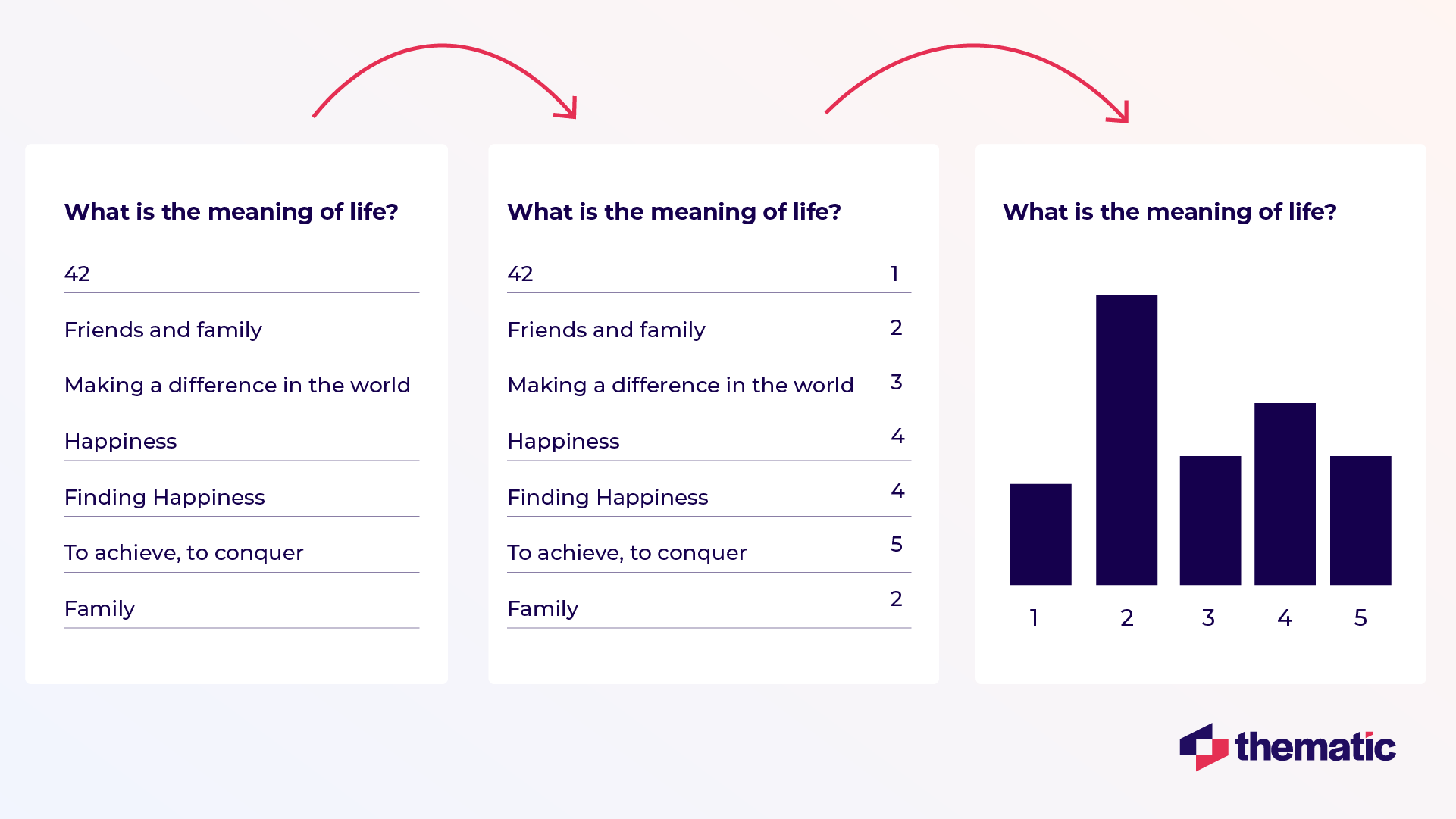
If you want to analyze your surveys, you'll need to code them.
There are a few different ways to code open-ended questions which we will cover in this section. Keep in mind that they all require human oversight to verify the accuracy.
Manual coding is still a viable option if the number of regular responses you receive is low. But it is highly likely that the analyst will apply their own biases and may miss particular themes they don't think matter.
That's why many organizations choose to automate the coding. You can use an AI algorithm to simulate the work of a professional human coder at scale.
Whichever way you code text, the aim is to determine which category a comment falls under. In the example below, any comment about friends and family falls into the second category.
Then, you can easily visualize it as a bar chart.
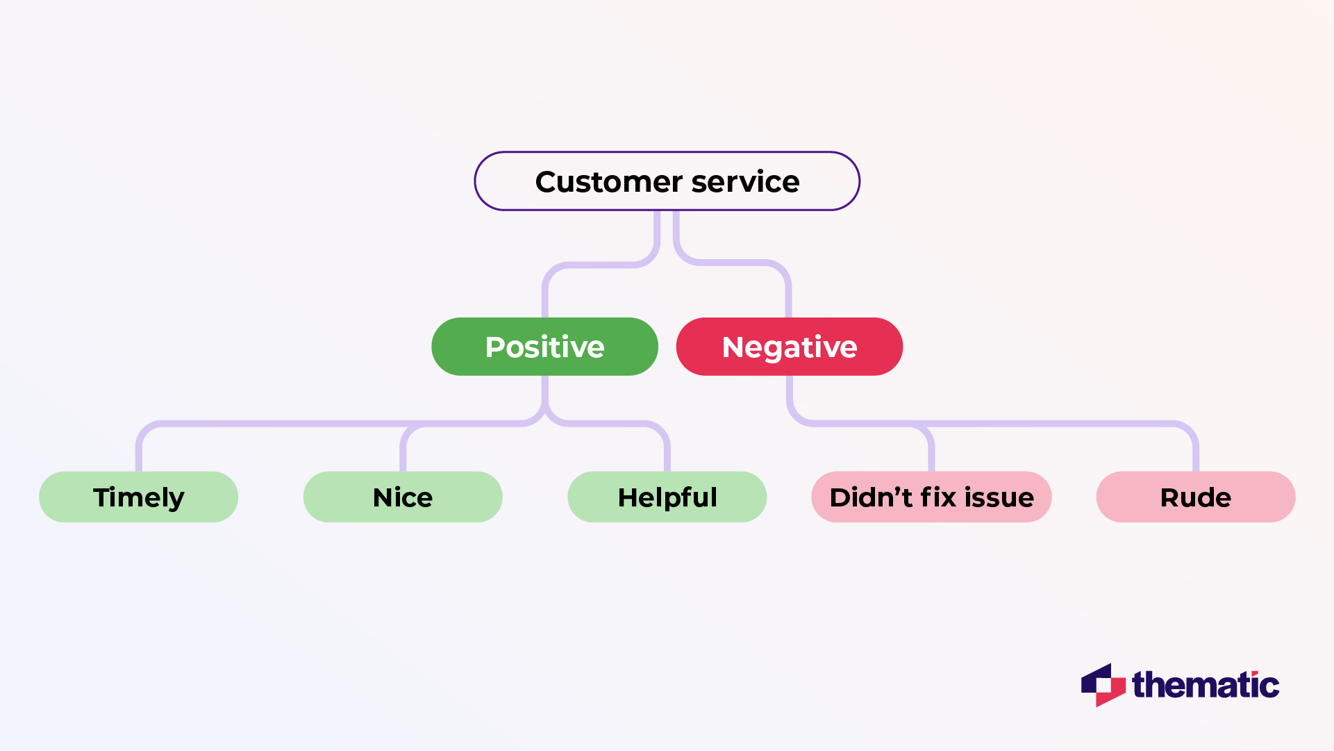
Code frames can also be combined with sentiment. In the example below we're inserting the positive and the negative layer under the theme "customer service."
In this example you can see that "didn't fix issue" is negative whereas "helpful" is coded as positive.
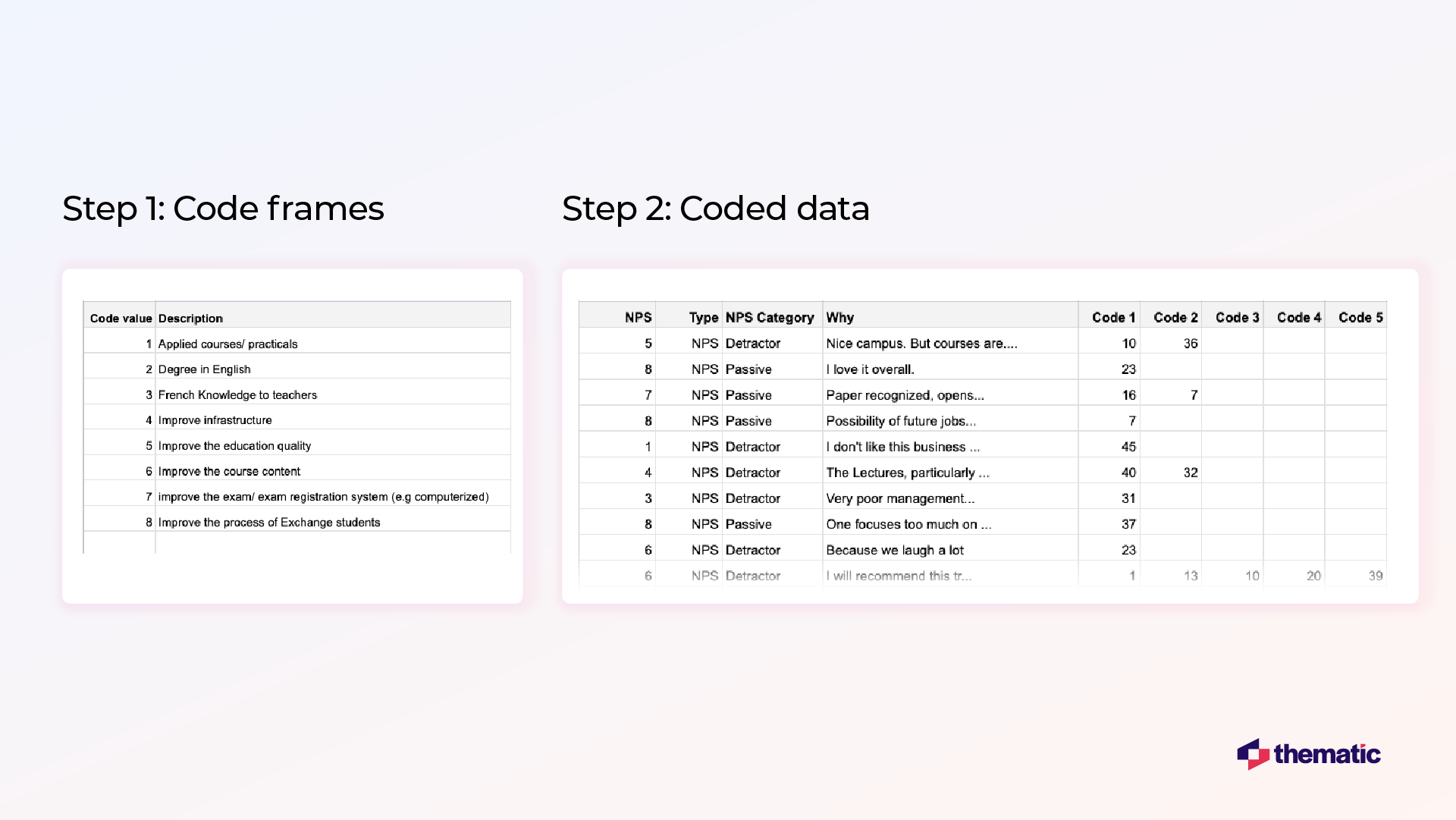
The next step is to apply this code frame. In the image below you can see snippets from a manual coding job commissioned to an agency.
In the left table there's the code frame. Under code 1, they code "Applied courses", and under code 2 "Degree in English."
In the right table you can see the actual coded data. Each comment has up to 5 codes from the code frame.
You can imagine that it's actually quite difficult to analyze data presented in this way in Excel, but it's much easier to do it using AI-powered software.
Traditional survey analysis is highly manual, error-prone, and subject to human bias.
You may think of this as the most economical solution. But in the long run, it often ends up costing you more.
Here are the key disadvantages of manual survey analysis:
Some organizations with smaller quantities of data may be able to manage with manual analysis.
But when you're dealing with lots of complex data, it is near impossible to manage it all properly manually. AI tools are great for automating the process and analyzing huge datasets simultaneously.
They can also pull out insights human analysts might miss and better identify broad patterns across the whole dataset.
There are many tools on the market that can help you analyze your qualitative data, ranging from simple options like Excel to advanced AI tools like Thematic.
Let's look at how you could use Thematic to enhance your analysis.
Thematic is an AI-powered survey analysis platform that automatically identifies trends in sentiment and themes in your data.
Thematic works by leveraging Large Language Models (LLMs) to process vast amounts of qualitative data and extract language nuances, context, and sentiment. This gives you a more detailed understanding of the underlying themes present in your survey responses.
Unlike black-box AI tools, Thematic gives research teams transparent control. You can validate, edit, and refine AI-generated themes to ensure accuracy—making your survey insights auditable and defensible for executive reporting.
Below you can see an example of how Thematic works. The tool identifies themes and sub-themes in your survey responses.
You can dig deeper by exploring each theme and pinpointing any customer issues that need addressing. Or you can take a birds-eye view and track how customer sentiment and comments related to this issue change over time.

Thematic also uses Generative AI to provide useful summaries of each theme. In the bottom left corner you can see more information for the theme "setup and configuration."
For example, in this case customers are asking for "the addition of a dark mode feature in Confluence." These insights can show you at a glance what your customers really want and need.
If you're a DIY analyzer, there's quite a bit you can do in Excel.
Excel doesn't offer the sophisticated features of an AI-powered tool. But for simple tasks it does the trick.
The easiest option is to count different types of feedback (responses) in the survey, calculate percentages of different responses, and generate a survey report with the calculated results. For a technical overview, see this article.

Another option is to build your own text analytics solution manually using Excel. Although it might sound complicated, this can be a surprisingly quick and easy solution if you're dealing with small amounts of responses.
The following is an excerpt from a blog written by Alyona Medelyan, PhD in Natural Language Processing & Machine Learning.
Alyona outlines how you can type in a formula in Excel to categorize comments by theme. For example, you might use the themes "billing", "pricing" as in the image below.

Although this is an easy and quick solution, it does have limitations.
In the image below you can see some of the errors and issues with this approach:
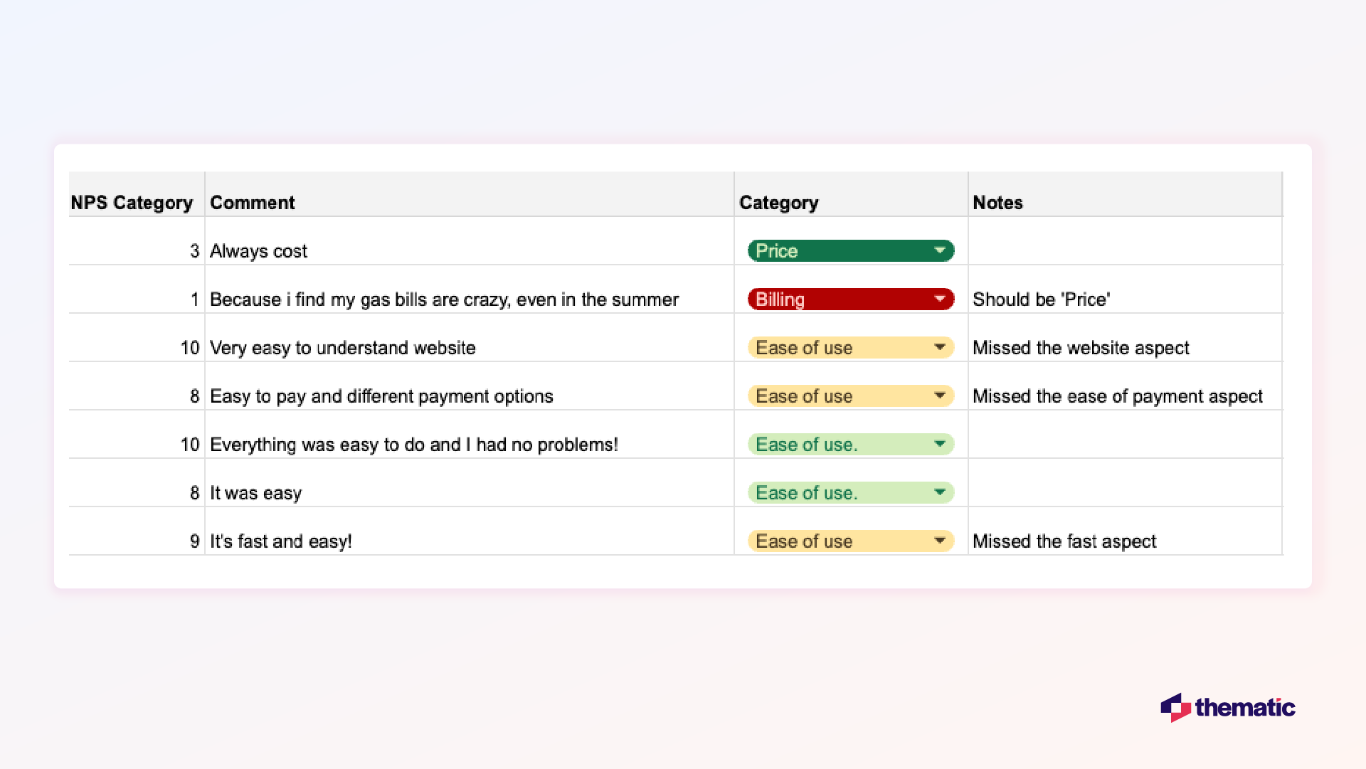
Only 3 of the 7 survey responses here were categorized correctly using Excel. In row 3 the comment should be "price" rather than "billing" and three more comments missed additional themes.
At best this approach was only 50% accurate.
Developed by QRS International, NVivo is a tool where you can store, organize, categorize and analyze your data and also create visualizations.
NVivo lets you store and sort data within the platform, automatically sort sentiment, themes and attribute, and exchange data with SPSS for further statistical analysis.
There's also a transcription tool for quick transcription of voice data. It's a no-frills online tool that's great for academics and researchers.

Interpris is another tool from QRS International which allows you to import and store free text data directly from platforms such as Survey Monkey.
Useful features include automatically detecting and categorizing themes.
Interpris is favoured by government agencies and communities because it's good for employee engagement, public opinion, and community engagement surveys. Other similar tools worth mentioning (for survey analysis but not open-ended questions) are SurveyMonkey, Tableau and DataCracker.
ChatGPT uses a transformer (a deep Learning Model) to produce informative and contextually appropriate replies based on prompts.
When you input a prompt, the model predicts the next word based on the context of the preceding words. This is how ChatGPT generates coherent and relevant responses.
ChatGPT can analyze survey data on a small scale by identifying common themes, keywords, and sentiments in the responses. For example, a retail company could input survey results about customer satisfaction.
ChatGPT might highlight common themes, such as "long wait times" or "friendly staff." It can also identify the sentiment (positive, negative, neutral) associated with specific comments.
However, manual review is critical to ensure accuracy and context. ChatGPT and similar tools may not accurately quantify sentiment without clear guidelines.
ChatGPT often also overlooks subtle patterns in open-ended responses. This limits their effectiveness in comprehensive survey analysis.
For more information you can read our guide on how to analyze data using ChatGPT.
The right tool is the one that fits your budget, delivers accurate and reliable results, and is flexible enough to adapt to your needs.
Be sure to test the tool before you purchase or at least get a demo from the sales team using your own data.
Here's some key criteria to bear in mind to help you select the best tool for your organization:


Now you know the basics of survey analysis, let's look at some best practices for getting accurate and useful insights that can actually make a difference.
Consider how many people you need to survey to get accurate results.
You probably won't be able to survey all of the customers you want to speak to. So you should plan to take a subset of your target customers and learn what you can from them.
The larger your sample size is, the more accurate your results will be. On the flip side, larger survey campaigns can be more costly.
The way to get around is to perform a sample size calculation before starting a survey. This gives you a large enough sample size to draw meaningful conclusions without wasting time and money by sending out too many surveys.
How do you know you can "trust" your survey analysis? How confident are you using this data as a basis for your decision-making?
The "significant" in statistical significance here refers to how accurate your data is.
It's a question of how representative your results are of the overall sample. If your data has statistical significance, it means that the survey results are meaningful.
And it also shows that your respondents "look like" the total population of people you want to study.
Think about how you will present your findings.
When reporting back to stakeholders, make sure you highlight the insights first and then link these back to the survey data. Remember not to overload non-technical teams with huge quantities of data.
For example, you might choose to use visualizations and summaries of your data from Thematic. In the image below you can see a summary of the theme "keyboard" which highlights important issues and customer suggestions for improvement.
This type of information is easily digestible for different types of teams and stakeholders.

Don't stop at the survey data alone.
When presenting your insights it's always helpful to use different data points. For example, you might choose to layer insights from your survey responses with data from finance or operations teams.
This can give unique insights into customer spending patterns, customer retention, or product returns.
Customer surveys are important in data-driven decision making. A recent study says,
“The ability to gather, analyze, and leverage customer data has become critical to this new marketing paradigm (data-driven marketing paradigm). Companies now have access to unprecedented data, allowing them to gain insights into customer behavior, preferences, and trends."
However, analyzing a survey is not without challenges. Let's look at a few of these.
When you start analyzing your survey data you will probably have some biases or expectations.
It's easy to project these onto your data and look for insights that match your own assumptions. Insights should come from the data, rather than the other way around.
How to fix it: Try to avoid forming any conclusions until your analysis is complete.
Sometimes the data can reveal uncomfortable truths about certain parts of the business or product flaws. Try to keep the analysis process separate from any teams or individuals who might be referenced in survey responses.
Think about how you can present these insights in a neutral way that focuses on solutions rather than assigning blame.
Just because two variables seem to be correlated doesn't mean that one causes the other.
For example, you might notice that more product issues are reported during the holidays. This doesn't necessarily mean that there ARE more issues.
It probably just means more people are using these products, and using them more than usual, since they have more free time.
How to fix it: If you notice a link between two variables, there are a few things you can do to see what's going on.
Firstly, apply a quick common sense check to see if there logically could be a causation. And secondly, dig deeper into the data to see if there's any more evidence for this link.
If things are still not clear, you could even send out another survey to find out more.
Chasing accuracy at all costs isn't helpful.
It is better to have insights that are useful rather than strive for 100% accuracy. For example, one solution might have 100% accuracy, but only give you information on which surveys mention the theme "billing."
Another solution might have 85% accuracy, but it also gives you actionable details like "billing date is inconvenient", "billing terms have improved" and "billing isn't accurate."
Clearly the second one is the winner!
How to fix it: Accuracy is important, but not at the expense of detailed and actionable insights. Look for an analytics tool that gives you enough depth and breadth as well as an acceptable level of accuracy.
Some surveys you send out will be one-off surveys.
This might include post-purchase surveys which are automatically sent by email. But in general you want to have consistent and regular survey responses so you can track improvements and changes in customer sentiment over time.
This also shows your customers that you take their opinions seriously.
How to fix it: Survey analysis is best done on an ongoing basis.
Consider planning out which surveys you will send out for the year ahead. You might want to schedule regular focus groups or customer interviews.
And remember to try to spread your survey requests across your customer base. Your customers will appreciate not being bombarded with emails!
Good surveys start with smart survey design.
Here are our top tips for creating surveys that entice your customers to respond and deliver useful and accurate data.
Only include questions that you are actually going to use.
You might think there are lots of questions that seem useful. But asking too many or the wrong questions can negatively affect your survey results.
We often ask redundant questions that don't contribute to the main problem we want to solve. Your survey can be as short as three questions.
To avoid enforcing your own assumptions, use open-ended questions first.
Starting with checkboxes or lists can be intimidating for survey respondents. An open-ended question feels more inviting and warmer.
It makes people feel like you want to hear what they want to say and actually start a conversation.
Closed questions are easier to respond to, but they give you less insight than open-ended questions. The best approach is to use a mix of both types of questions.
Respondents respond better when there's a variety of question types. For example, you might want to include a star rating and a couple of open-ended questions for more detail.
Your surveys will reveal what areas in your business need extra support or what creates bottlenecks in your service.
Use your surveys to present solutions to your audience and get direct feedback in a more consultative way.
Think about the timing of your survey.
Take into account when your audience is most likely to respond to your survey. Give them the opportunity to do it at their leisure, at the time that suits them.
Include multiple survey writers where possible.
Having the team read each other's work and test the questions helps address the fact that most open-ended questions can be interpreted in different ways.
As a respondent you want to know your responses count.
Sharing the results of your surveys, and the actions you've taken, adds extra incentive for future participation and boosts brand loyalty. Customers will think more favorably of your company if you respond to their comments and improve things going forward.
And finally, always think about what customers (or survey respondents) want and what's in it for them.
Many businesses don't actually think about this when they send out their surveys.
If you can nail the "what's in it for me", you automatically solve many of the possible issues for the survey. You might consider offering an incentive for survey respondents to boost participation.
This could be in the form of a discount or some other benefit like a free webinar or e-book.
For more pointers on how to design your surveys for valuable insights, check out our blog on 4 Steps to Customer Survey Design – Everything You Need to Know.
If you're still not sure which is the best tool to analyze your survey data, why not try a free guided demo of Thematic.
You can use your own survey data during the trial and find out if it's the right tool for you. See how Thematic delivers transparent, research-grade survey analysis at enterprise scale, combining AI automation with human-in-the-loop control for insights executives can trust.
Book a guided trial with your own data
Thematic is an AI-powered survey analysis platform that automatically codes open-ended responses and identifies themes at enterprise scale. Unlike black-box tools, Thematic gives research teams transparent control to validate and edit themes, making insights auditable and defensible for executive reporting.
Use AI-powered text analytics platforms like Thematic to automatically code and categorize open-ended responses. The platform identifies themes, tracks sentiment, and quantifies patterns across thousands of responses—while maintaining research-grade accuracy through human-in-the-loop validation you control.
Yes. Thematic combines AI automation with human-in-the-loop oversight, delivering research-grade survey analysis that executives can trust. The platform auto-codes responses at scale while giving researchers transparent control to validate, edit, and refine themes—ensuring accuracy without sacrificing speed.
Manual survey analysis is time-intensive, prone to human bias, and difficult to scale. AI-powered platforms like Thematic process thousands of responses simultaneously, identify patterns humans might miss, and maintain consistency—while researchers validate results for accuracy executives can trust.
Thematic's Themes Editor gives researchers transparent control to validate, edit, merge, or create themes identified by AI. Unlike black-box tools, you maintain human-in-the-loop oversight—the AI suggests themes based on data patterns, but you validate every decision for research-grade accuracy.
Use platforms like Thematic that maintain transparent, auditable records of every coding decision. The system documents how themes are identified, validated, and refined—creating a clear audit trail that compliance teams and executives can review to verify methodology and trust insights.
While AI significantly enhances survey analysis by identifying trends and sentiment at scale, relying solely on it can lead to misinterpretations in nuanced feedback. AI models can reflect biases in training data. The best approach combines AI automation with human expertise—platforms like Thematic balance speed with human-in-the-loop validation for context and accuracy.
Survey data combined with AI and machine learning identifies patterns to forecast behaviors like purchase intent or churn risk. Predictive models analyze sentiment trends, complaint frequency, and satisfaction shifts. Platforms like Thematic track theme evolution over time, helping businesses anticipate issues before customer loyalty drops.
Cultural differences influence how people interpret and respond to survey questions. Some cultures tend toward extreme ratings, while others prefer neutral responses. Surveys should be carefully localized with culturally appropriate wording. AI platforms with multi-language support and human validation help ensure accurate analysis across regions.
Join the newsletter to receive the latest updates in your inbox.


Transforming customer feedback with AI holds immense potential, but many organizations stumble into unexpected challenges.