Most companies waste resources chasing high-volume complaints while the real damage comes from quiet, low-frequency issues that devastate retention and NPS scores.
Identify who's affected (which customer segments are at risk)
Track velocity (is it accelerating?)
Prioritize using: Impact × Segment Value ÷ Effort, not just mention frequency.
A spike in complaints doesn't mean your biggest problem got bigger. It means your most visible problem got louder.
After analyzing hundreds of feedback spikes, the pattern is clear: volume doesn't equal impact.
OrionAir proved this. Service complaints dominated their dashboards, so leadership reallocated resources assuming they had a crisis. Then they ran impact analysis.
Baggage handling wasn't the most frequently mentioned issue.
But it caused –1.6 NPS points of damage, the largest negative impact across all touchpoints.
Even better: 80% of those issues were operationally fixable.
The real damage hides in the quiet 5–10%. Failed payments, login crashes, policy edge cases pull NPS down by double digits and put your highest-value segments at risk.
Miss them, and you waste time fixing complaints that don't improve retention.
Here's how to identify actual damage instead of chasing the loudest voices:
Measure impact first. Which issues actually damage scores?
Identify who's affected. Which segments are at risk?
Track velocity. Is the problem accelerating or stabilizing?
Three questions that turn complaint floods into a short, defensible priority list.
Why customer complaints increase and why leaders panic
Here's what happens when complaint volume spikes.
Dashboards light up. Leaders scramble. Teams get pulled into emergency meetings.
The pressure to act fast is intense.
But here's the problem: rising complaint counts don't reveal which issues are hurting retention.
Their team debated whether to add music theory lessons after seeing it ranked as the 4th most mentioned improvement request in customer feedback.
It looked like a priority. Internal opinions were split. The topic had become "touchy" in the office.
Then they ran Thematic's impact analysis.
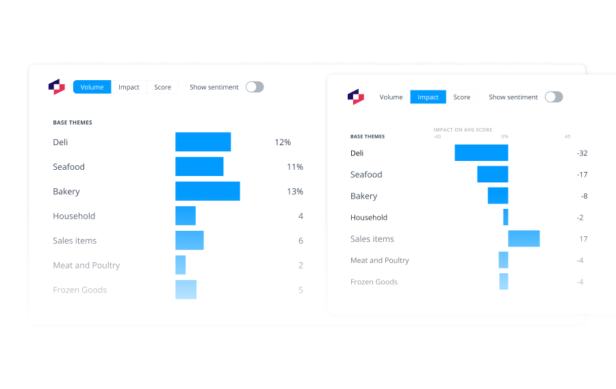
Music theory had minimal NPS impact despite the high mention rate. Meanwhile, app lag (mentioned far less frequently) was causing the biggest negative impact on customer scores.
Sam Stokes, Head of Customer Experience, explained the insight: "We could also see that lots of people wanted more lessons in the app, but, interestingly, lessons are not that important to the actual score."
Volume shows what customers talk about most.
Impact shows what actually destroys satisfaction.
Mistake 2: Trusting averages instead of segments
Averages hide more than they reveal.
Breaking feedback into segments shows where pain concentrates and where revenue risk lives.
At the aggregate level, device issues looked like a moderate problem. A 40% call reduction seemed solid.
But segmentation told a different story.
Unaccepted mortgage requests had the highest reduction potential at 69%. These weren't just any customers. They were people trying to get mortgages approved: the bank's highest-value segment.
By prioritizing this group first, Atom Bank addressed the most revenue-critical friction point.
Michael Sherwood, Head of Customer Experience, explained: "We are able to easily differentiate between verbatim themes that are noise (no impact to an overall metric) and those which are seriously impacting our CX metrics."
Segmentation revealed where the real business risk lived.
Without it, Atom Bank might have spent resources fixing device issues (40% impact) while leaving their highest-value customers stuck at 69% call volume.
Mistake 3: Burning weeks on analysis while problems compound
Speed builds credibility. Executives want answers in days, not weeks.
Most teams get stuck in manual analysis loops.
DoorDash experienced this while processing tens of thousands of NPS responses from three distinct audiences: consumers, merchants, and delivery drivers.
Zach Schendel, Head of Research, explained the challenge: "It's impossible for me, or anyone else, to find anything useful from that information unless it's tamed in some kind of way."
His lean research team completed nearly 1,000 bespoke projects over two years. But without the right tools, speed was impossible.
Once they adopted Thematic, everything changed.
The team identified a merchant NPS decline tied to the menu manager tool. Merchants spent up to a week updating menus because the interface scrolled them back to the top after every edit.
With fast analysis, DoorDash redesigned the tool. Load times dropped from 11 seconds to under 3 seconds. Merchant satisfaction soared.
The transformation went deeper. DoorDash moved from "Research" to "WeSearch," democratizing insights across the entire organization.
Manual analysis turns spikes into firefights.
Fast, AI-powered analysis turns them into strategic wins.
The 5-step complaint escalation checklist
If frequency and averages don't work, what does?
Here's the playbook that separates noise from signal and earns executive trust.
Step 1: Ingest and connect complaints with metadata
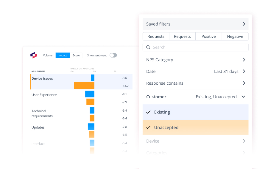
Pull in complaints with context: customer tier, lifecycle stage, region, product line. Without metadata, you're analyzing blind.
Step 2: Theme and impact analysis
Quantify score damage, not mention counts. Which issues actually drag NPS down by double digits?
Step 3: Segment cut
Identify which customers are at risk. Enterprise customers complaining about billing? That's different from free users complaining about user interface.
Step 4: Trend check
Separate accelerating issues from stabilizing ones. Is this getting worse or plateauing?
Step 5: Prioritize and assign
Score fixes with a simple formula: Impact × Segment Value ÷ Effort. Quick wins surface immediately.
Atlassian used this framework to process 60,000 pieces of monthly feedback across Jira, Confluence, and Trello.
Result: Product teams could act on feedback immediately instead of waiting weeks for analysis decks.
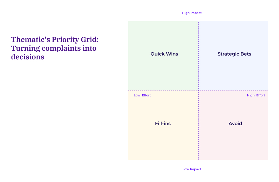
Thematic's Priority Grid: Turning complaints into decisions
Once you know which issues cause the most damage, you don't need another backlog. You need a decision framework.
The Priority Grid combines Impact × Segment Value with an Effort overlay so trade-offs become crystal clear.
Here's how it works.
Plot each theme by three dimensions:
Impact: How many NPS points does it drag down?
Segment Value: What's the LTV, revenue, or strategic weight of affected customers?
Effort: What's the time, cost, and complexity to fix?
Then work the quadrants:
Quick Wins: High impact, high segment value, low effort. Act immediately
Strategic Bets: High impact, high effort. Plan and resource properly
Fill-ins: Low impact, low effort. Batch these together.
Avoid: Low impact, high effort. Defer indefinitely.
Quantifies drivers so debates become data discussions
Visualizes trade-offs so executives see the logic
Makes next steps defensible to product and executive teams
Filter by customer segment to find revenue-critical issues. Track which fixes shift scores for the right cohorts. Present priorities backed by impact math, not opinion.
How to get executive approval in one meeting
Volume and sentiment don't close the room. Evidence does.
After hundreds of presentations, three proof points consistently win approval:
1. Coverage: Show what share of complaints each theme represents
This prevents overreactions to vocal outliers. Is it 2% of feedback or 22%? The difference matters.
2. Significance: Prove the signal is real
Include sample size, pattern stability, and trend direction. One-week spikes look different than nine-month patterns.
3. Attribution: Link NPS movement to specific themes
Use a score-change waterfall to show exactly which issues drive metric shifts. No guessing, just math.
Tania Parangi, NPS Evolution Manager, explained: "Thematic helps us identify themes in customer feedback which informs where our teams should focus their attention. They also clearly show us the positive and negative impact of the changes we're making, so we can adapt and refine in real time."
The team tracked patterns for nine months to separate persistent issues from temporary spikes. They triaged impact immediately and validated emerging issues with data instead of debate.
Result: Vodafone New Zealand's tNPS increased and began outperforming their global counterparts. Cross-training programs (identified through theme analysis) delivered the biggest NPS lifts.
Package those three elements, and you replace opinion with proof.
Approvals speed up. Budgets go to fixes that actually move the score.
How to run the impact analysis playbook
Once executives are aligned, consistency matters.
Start here:
Pull your last 90 days of complaints. Run impact analysis.
Ship a one-pager with your top three fixes: impact (NPS points), coverage (%), segment at risk, owner, and ETA.
That's it. One cycle proves the model works.
Then build consistency:
Track trend slopes and cut by product, region, or customer tier
Set alerts for accelerating themes
Review the Priority Grid weekly with CX, Product, and Support
Publish a recurring escalation report so priorities stay visible
Before, support staff manually categorized feedback into five broad buckets (price, features, etc.). The tags were too generic to guide product decisions.
Aaron Eddington, Support Manager, explained what changed: "We immediately started seeing real, actionable and specific product issues that were affecting us."
The team gained confidence in their priorities because the analysis was as accurate as if their own staff had done it manually, but delivered immediately instead of taking days.
Stop chasing volume. Start fixing impact.
Low-volume, high-impact drivers usually hold the greatest revenue risk.
Ready to find yours?
Bring your last 90 days of complaints to a Thematic demo. We'll show you exactly which issues are bleeding loyalty, which segments are at risk, and the fastest fixes to stop the damage.
No setup required. Just answers.
Share
Link Copied!
Request a demo of Thematic's Customer Intelligence Platform
Thematic turns fragmented feedback into one consistent source of customer truth — so every team acts on the same customer story. Up and running in days, not quarters.
Thank you! Your submission has been received!
Oops! Something went wrong while submitting the form.

.webp)