In this article, we’ll walk through visualizing qualitative data insights with dashboards.
We’ll cover everything from how to collect and prepare your data to tips on choosing the right dashboard tool.
And even the best widgets to visualize the stories behind your data.
Dashboards Unlock the Value of Your Qualitative Data
Sifting through 30 Excel tabs to spot that one irate chat is not qualitative data analysis.
It’s time-consuming manual labor.
Dashboards surface trends in seconds and keep the original comments one click away, so your insight never loses its context.
Even non-technical teams can delve deeper into your datasets to get more details on a specific customer issue.
What a dashboard gives you
A real-time view – New feedback flows straight into one screen. There’s no need to wait for a quarterly deck export.
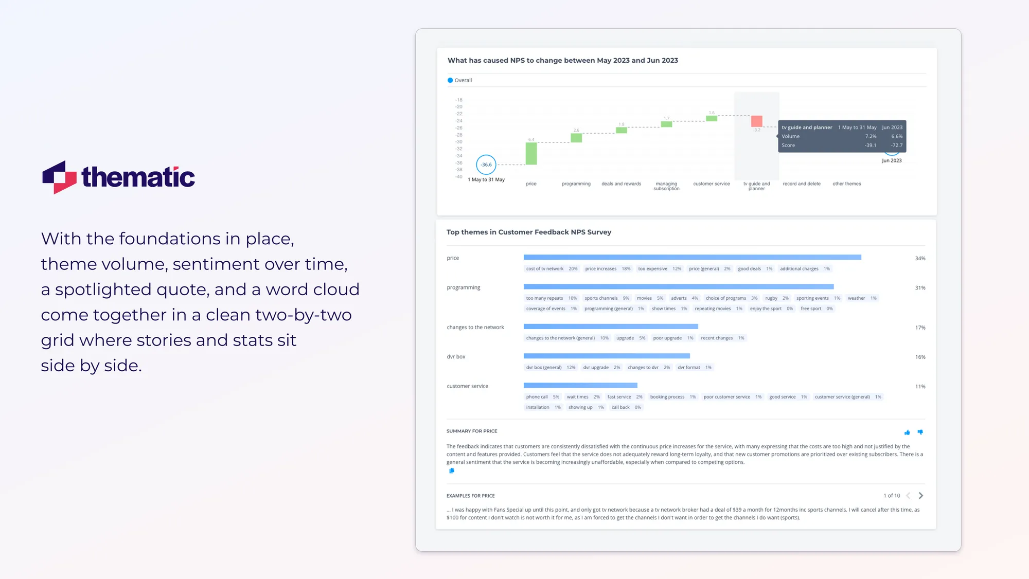
Story + stat in one glance – Pair the theme bar with a single customer quote so the human stays in frame.
Friction-free sharing – One secure link replaces a chain of bulky spreadsheets.
Next up: a four-step workflow to turn raw text into dashboard-ready data.
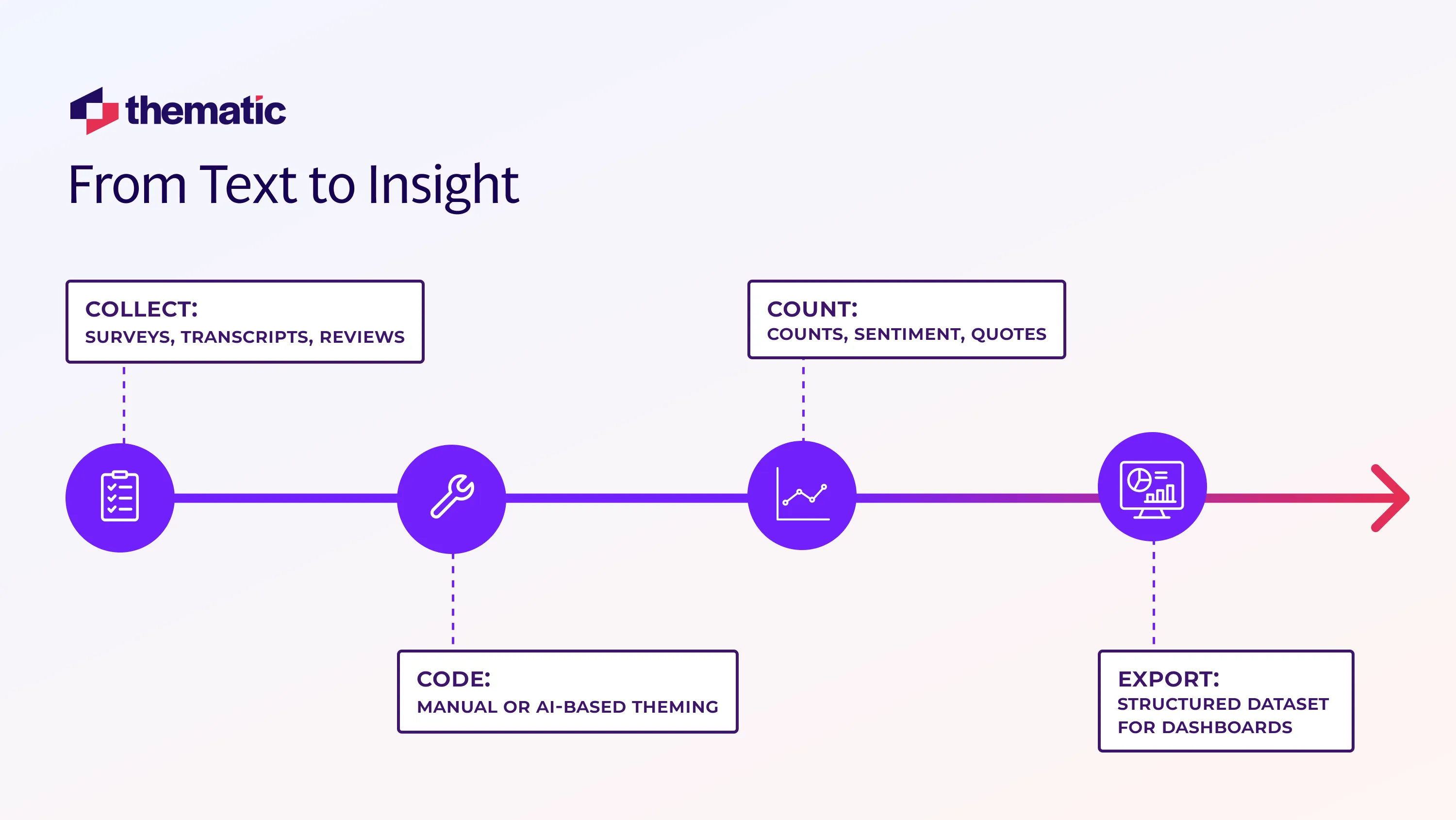
How to Convert Qualitative Text into Dashboard-Ready Data in 4 Steps
AI qualitative data analysis lets you turn messy customer feedback into clean and simple visualizations.
Here’s four simple steps for visualizing qualitative data insights with dashboards:
Collect (surveys, transcripts, reviews)
Code (manual or AI-based theming)
Quantify (counts, sentiment, quotes)
Export (structured dataset for dashboards
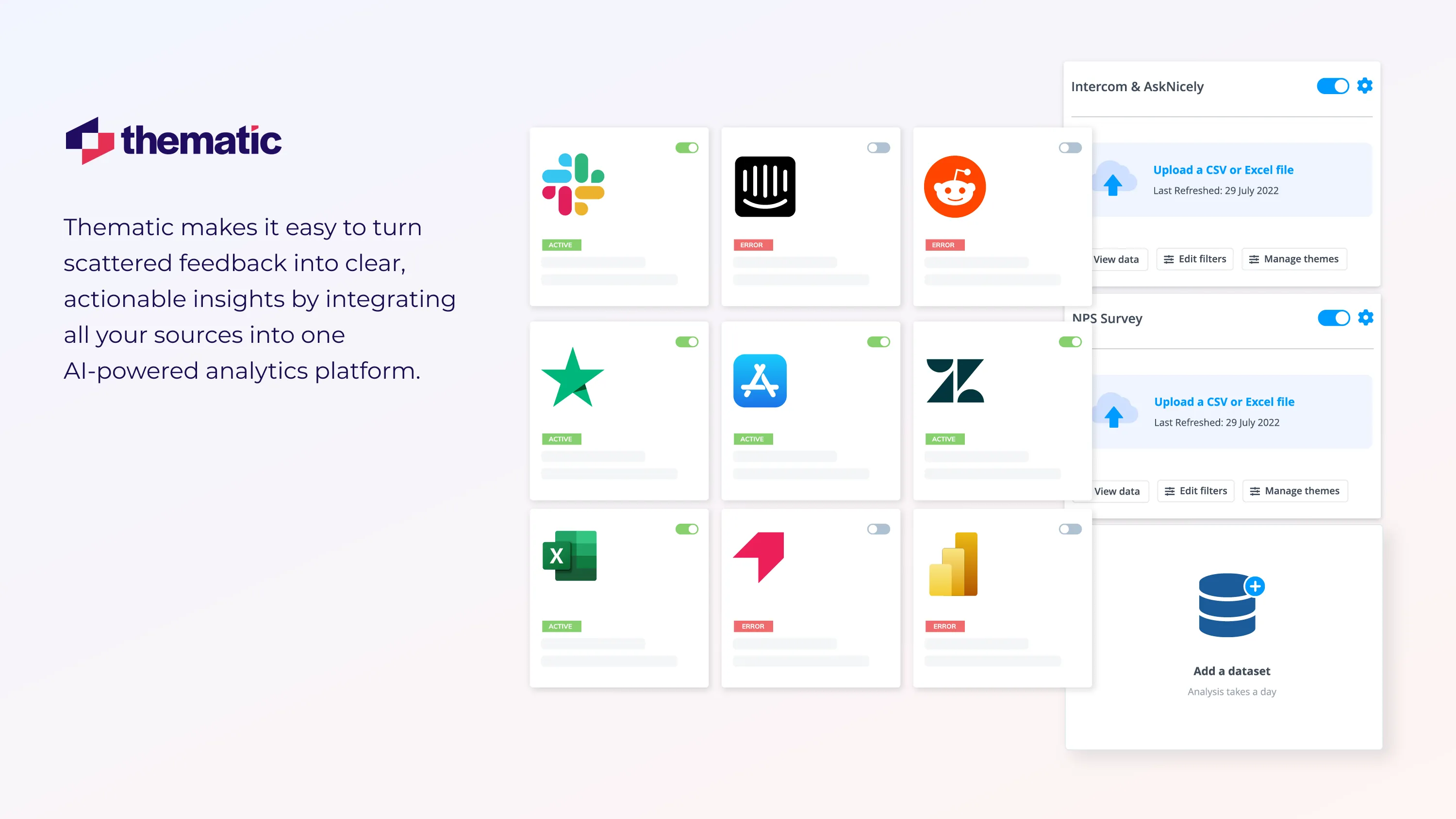
Step 1: Collect & Transcribe
First you need to pull everything into one place.
That could include your latest chat logs, survey responses, app-store reviews, or employee feedback.
The easiest way to do this is by integrating your feedback sources into an AI-powered feedback analytics platform.
With most AI-powered feedback analytics tools the process looks like this:
Research your chosen platform to find out whether they offer one-click integrations, API access, or you need to set up a custom integration with support from their team.
For one-click integrations and API access, find the Integrations settings on your chosen platform.
Most platforms have an API key you will need to enter to verify your identity.
If you want real-time data don’t forget to look for the “autosync” button so your data gets updated automatically.
For audio (interviews or calls), you’ll need to transcribe the audio first. Here’s how to do that:
Upload the files to a speech-to-text service like Descript or Otter.
Export the transcript.
Spot-check speaker tags and obvious typos before importing them into your platform.
Step 2: Tag Themes (Manual or AI)
The next step is to identify and code the themes in your qualitative data.
This can be done manually, but it's lengthy and time-consuming.
Your feedback analytics platform can shortcut the process by automatically identifying and tagging themes.
Let’s take a quick look at both the manual or AI solutions to tagging.
How To Tag Themes Manually Using A Spreadsheet
Coding qualitative data manually is simple but time-consuming.
Here's a quick guide:
Open your CSV in Excel or Google Sheets.
Create and assign initial codes. You can do this by adding a column and assigning concise words or phrases that capture the essence of an idea or concept expressed.
Now you’ve coded your data, start grouping those codes into broader categories or themes.
Log each theme in a three-column codebook (Theme | Sub-theme | Example).
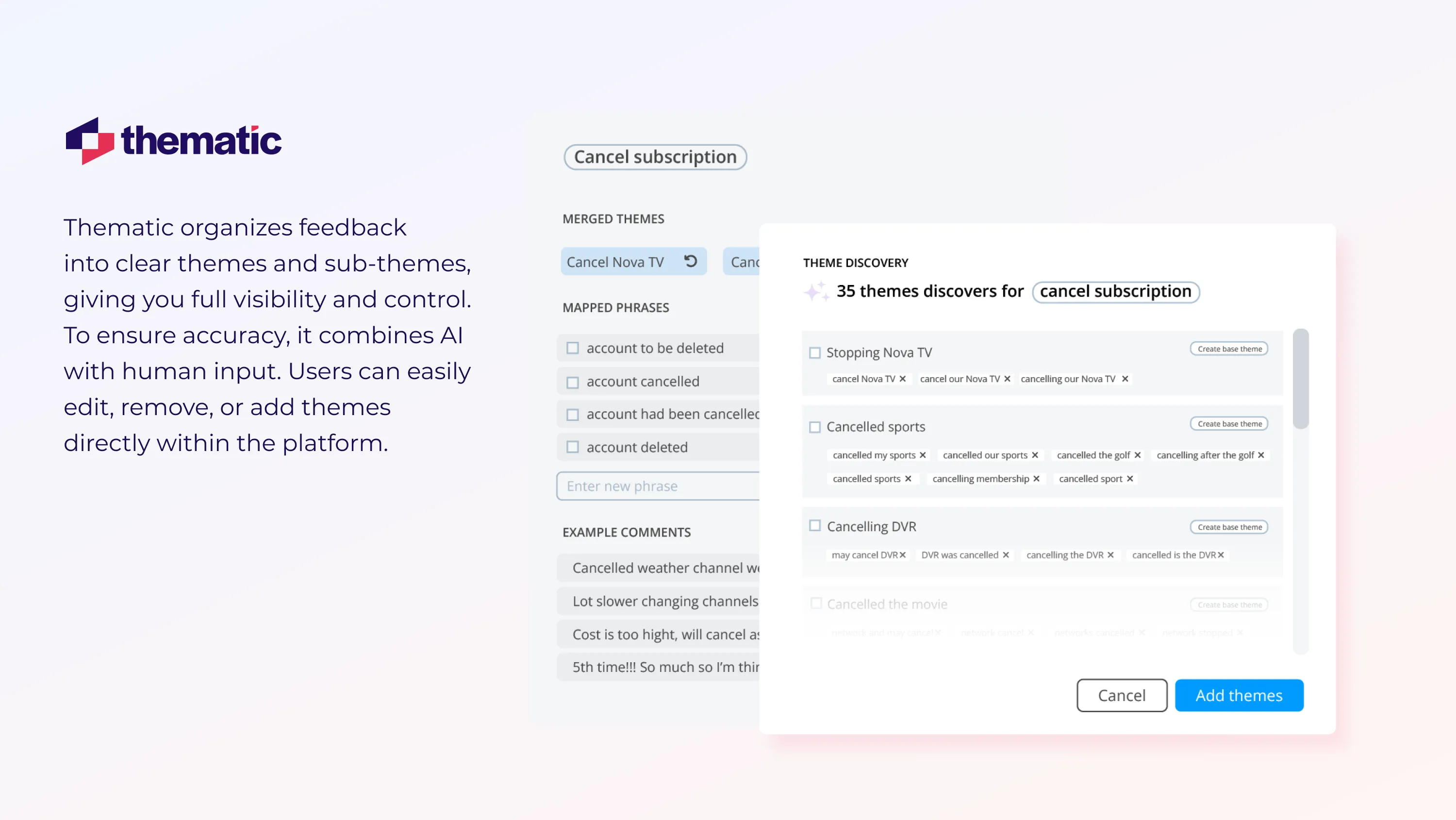
Thematic is one such AI feedback analytics platform, which we’ll use in the example below. With Thematic and most other thematic analysis software the process looks like this:
Connect your data sources to the platform if you haven’t done so already.
The AI automatically identifies and tags themes and sub-themes in your qualitative data (see below for how Thematic does this).
💡
Manually tweak your themes In the screenshot above you can see how Thematic tags and arranges themes and sub-themes. Thematic understands the tendency of AI to hallucinate, so it includes human in the loop. Users can easily edit, delete or add themes directly on the platform.
Thematic allows you to manually edit, delete and add themes. This is useful if you need to tweak your themes to meet specific business requirements. Or maybe certain themes just aren’t relevant. These changes will carry forward as new data is added.
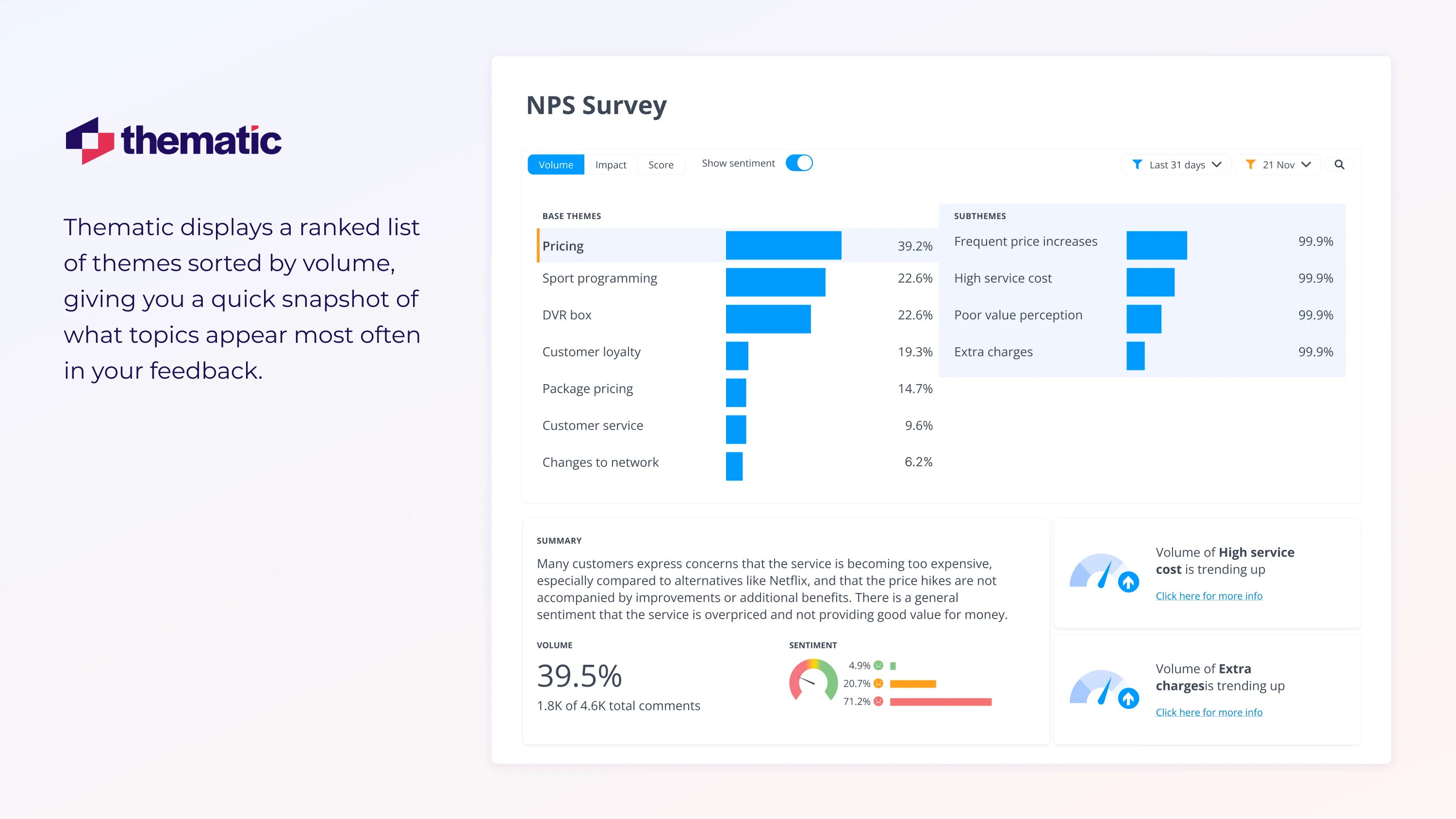
Step 3: Quantify The Themes
Now you have your unstructured qualitative data structured and themed nicely in either your spreadsheet or feedback analytics platform.
Your next job is to quantify the themes so you have useful data for your visualisations & dashboards.
In this step we’ll cover how to work with these themes to find out what your data is telling you.
Here’s how to manually quantify your themes:
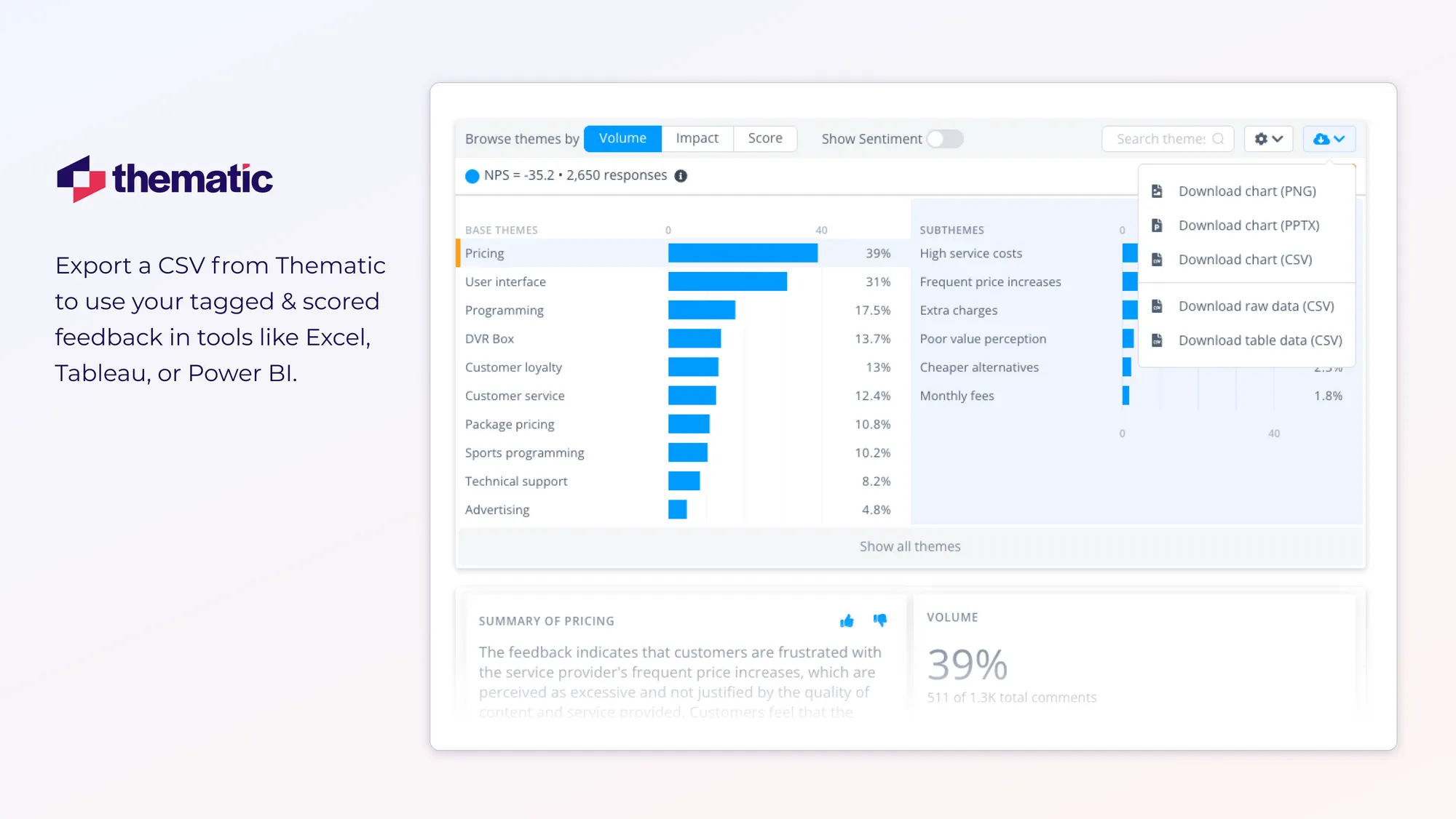
Rank your top themes: With a spreadsheet you can manually apply a filter or sort so the most-mentioned themes land at the top. Most platforms auto-sort by volume. See below for an example of how Thematic does this.
Add sentiment scores or impact:Add columns in your spreadsheet to quantify sentiment or impact, such as +1 for positive, –1 for negative. Many feedback analytics platforms like Thematic analyze sentiment automatically.
Track themes over time: Monitor change to your top themes on a quarterly or monthly basis to identify any emerging or persistent issues. Calculate month-to-month change manually using Excel or use built-in widgets in your analytics platform.
Step 4: Creating Dashboards & Visualizations
We’re now ready to create our dashboard.
There are two main options here.
You can use the dashboards offered by your feedback analytics tool.
Or you integrate the "transformed" data into tools like Tableau or Power BI.
1. Use Your Feedback Analytics Platform’s Native Dashboard Functionality
For Thematic the process looks like this:
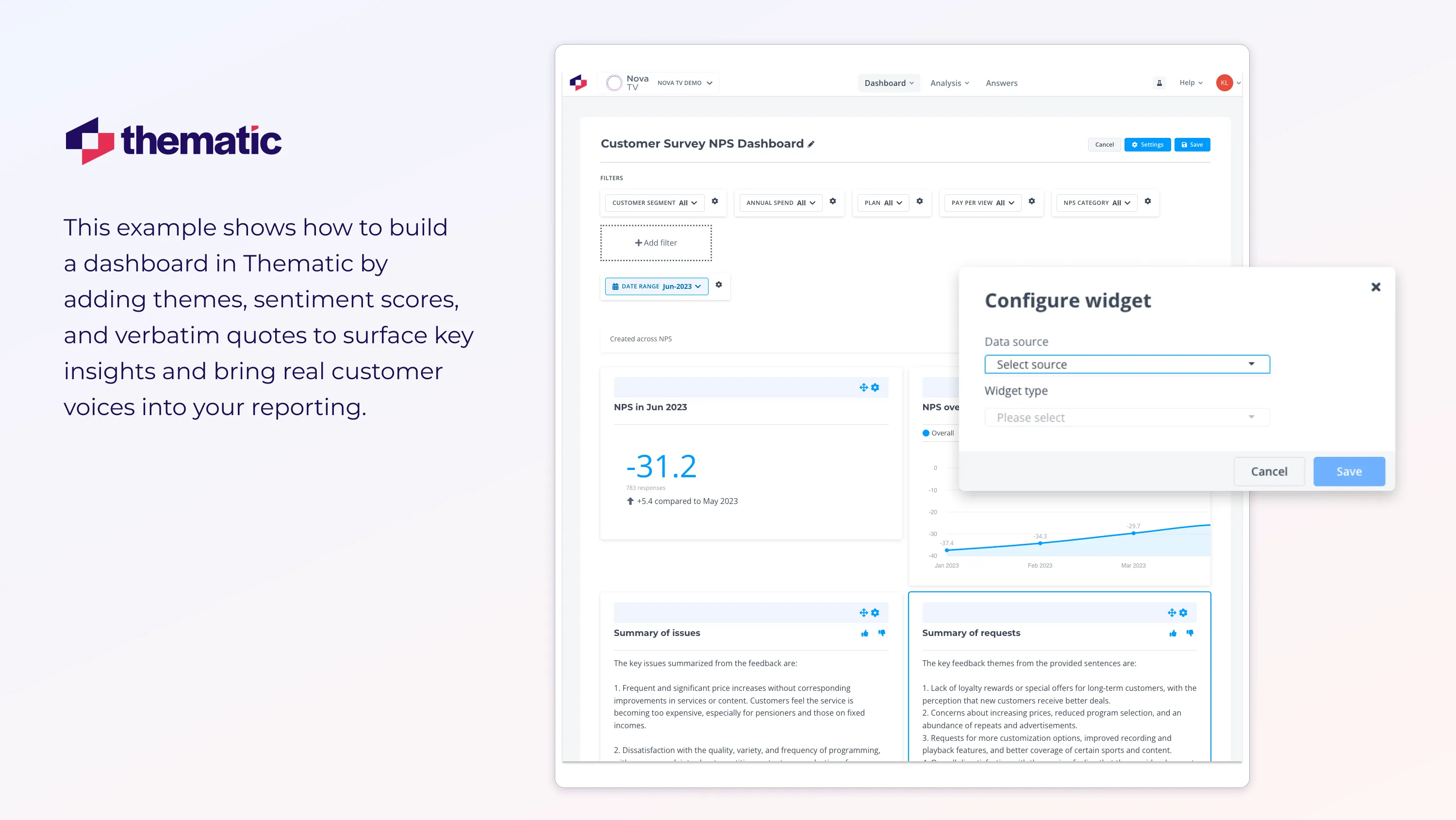
Open Dashboards → Create New → drag in Theme, Sentiment, Verbatim.
Apply filters, schedule auto-refresh, and share the live link.
Challenge: DoorDash had 10,000 open-ended NPS comments piling up, hiding the why behind a sudden NPS dip.
Solution: DoorDash piped the text into Thematic’s AI feedback dashboard to visualise qualitative data insights in real time.
What did DoorDash discover? - Analysis revealed a spike in the theme “Merchant Frustration” - Feedback quotes pinpointed widespread dissatisfaction with inefficiencies in the menu manager interface. For example, every time they deactivated an item, they would be scrolled back to the top of their menu list, wasting precious time and effort.
Action: Engineers patched the UX glitch and designed a more intuitive menu manager interface. Menu-edit time dropped from 11 s → 3 s.
Impact: Merchant NPS rebounded +8 points within two release cycles.
4 Essential Widgets for Qualitative Data Dashboards
Widgets are the building blocks of dashboards. They allow you to zoom in on a particular aspect of your data.
Simple widgets might highlight “Top Themes by Volume” or use Generative AI to summarize “Key Takeaways” for the past month.
Or you could dig deeper by visualizing the themes that have had the biggest impact on NPS scores over a certain time frame.
Let’s look at 4 essential widgets for building dashboards that are actually useful AND accessible:
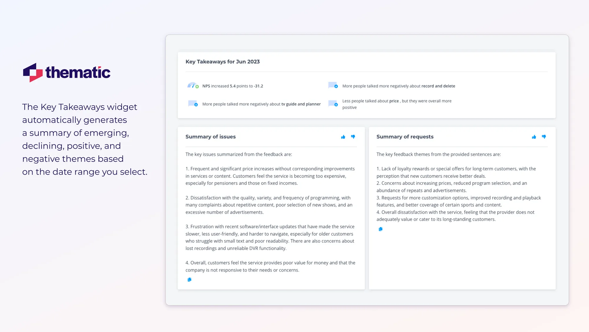
1. Key Takeaways Widget
What it does: Automatically generates an executive bullet list of emerging, declining, positive, and negative themes for the date range you set.
💡
Thematic’s Key Takeaways widget is a one-box summary that combines score movement with the top positive and negative themes for the selected period.
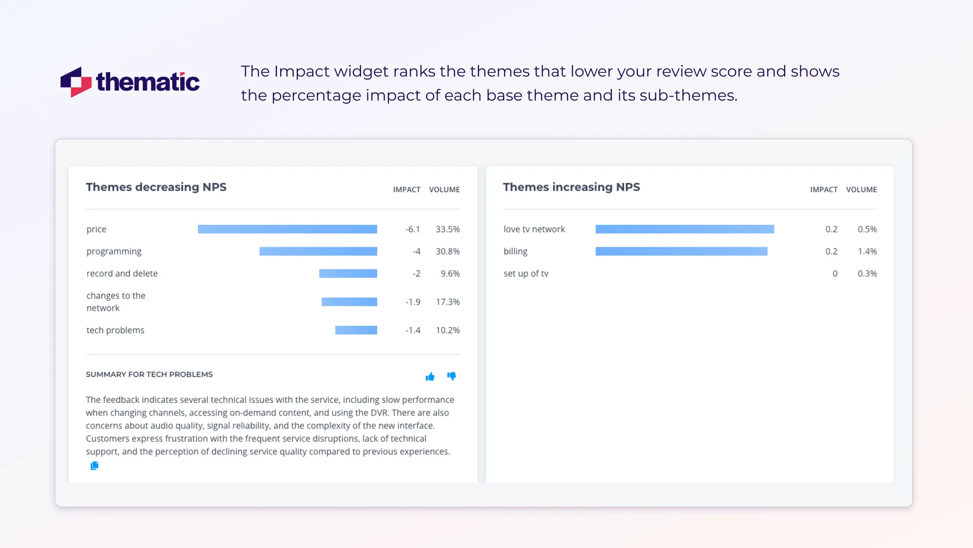
2. Impact widget (Positive & Negative Drivers)
This widget ranks themes by how much they move NPS/CSAT.
Here the bar length shows impact size.
You can toggle between negative and positive drivers, and then click a bar to drill into sub-themes and verbatim.
When to use:
Monthly business review
Prioritising fixes after an outage
Showing wins to execs without digging into raw data
💡
Impact widget ranks the themes that drag the review score down and quantifies each base theme (and its sub-themes) by percentage impact.
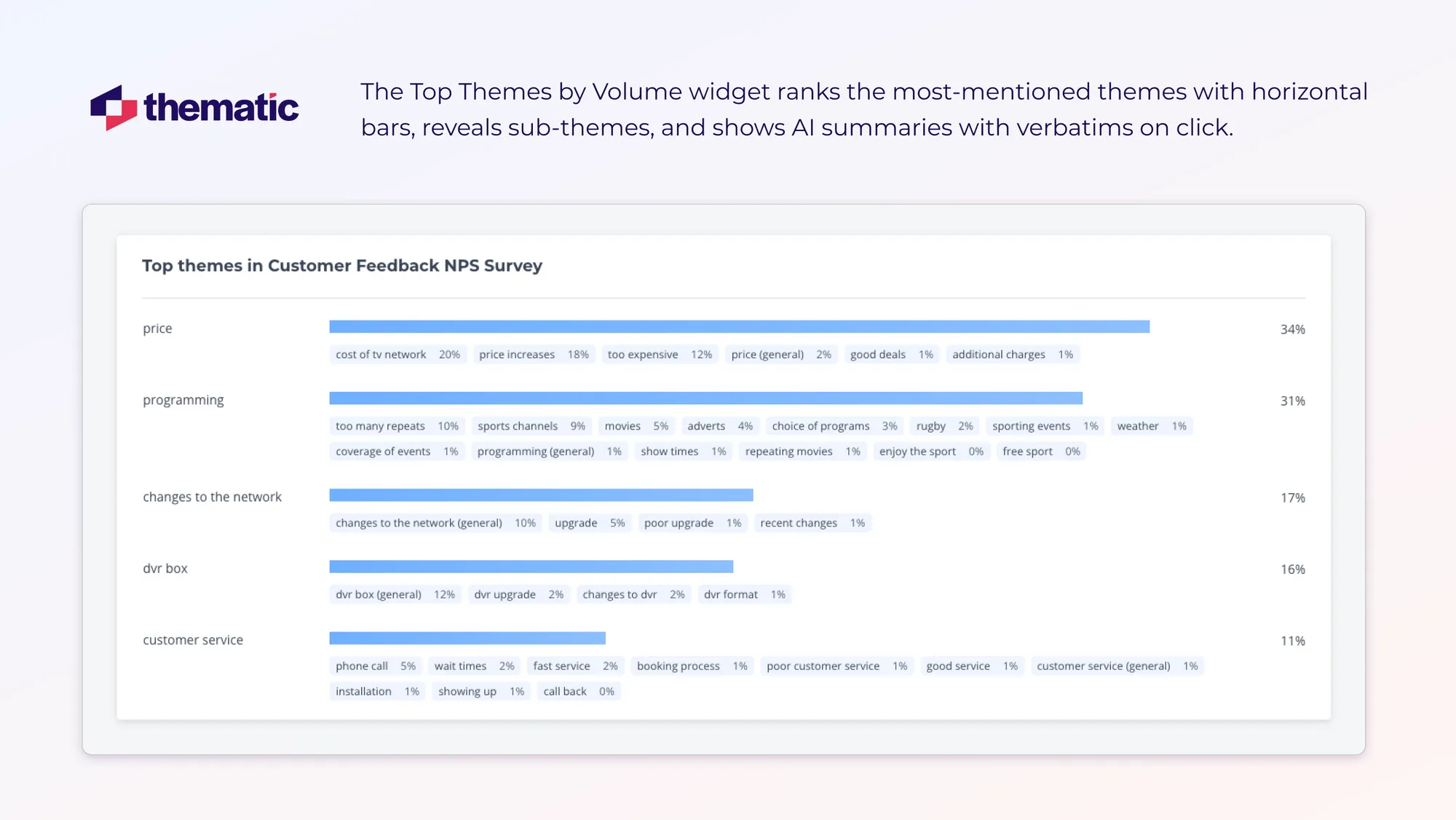
3. Top Themes by Volume
This widget shows the five themes your customers mention most with a handy summary at the bottom. Sub-themes are broken down below each themes.
Find out exactly what your customers are saying by clicking through to verbatim for each theme or sub-theme.
💡
Top Themes by Volume widget — horizontal bars rank the most-mentioned themes, expose their sub-themes, and open AI summaries plus verbatims on click.
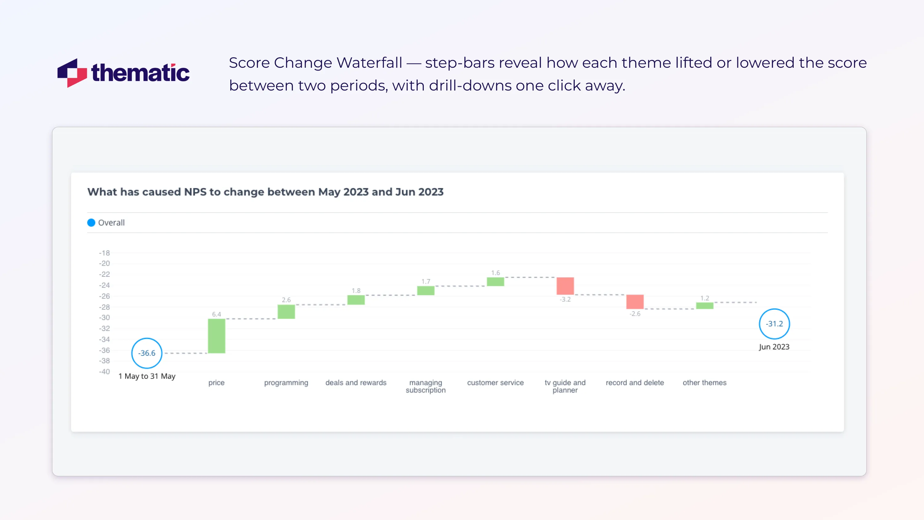
4. Score Change Waterfall
Find out why scores change. Here’s what you can do with what you see.
Step
What you see
What to do
1
Waterfall bars:
green ↑ = themes lifting the score,
red ↓ = themes dragging it down
Note the longest bar (e.g., "App Crash") for biggest driver
2
Hover tooltips show % change and comment count
Copy numbers into the post-mortem or QBR slide
3
Click a bar to open verbatims for that theme
Hand the examples to engineering or CX for root-cause work
Score Change Waterfall: bars reveal how each theme lifted or lowered the score between two periods, with drill-downs one click away.
So what’s Next? Build the dashboard.
Build a Qualitative Dashboard in 5 Steps
We’ve covered the basics of visualizing qualitative data insights with dashboards.
Now it’s time to pull everything together and create your dashboard.
Here’s five simple steps to get you started:
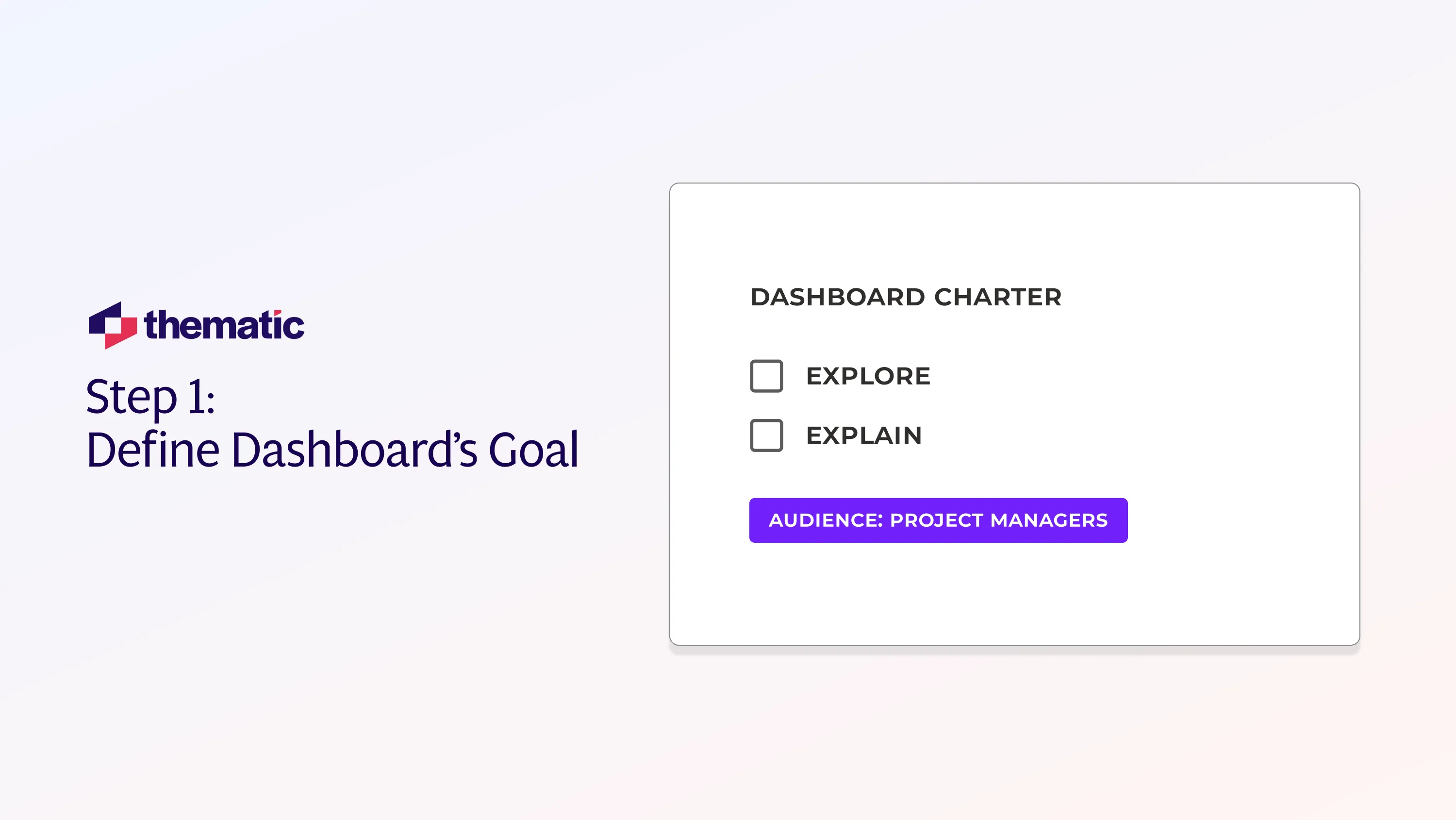
Step 1: Define Dashboard’s Goal
Start by figuring out what you want your dashboard to do. Most dashboards either explore or explain:
Exploratory boards let analysts poke around
Explanatory ones tell one specific story for executives and key stakeholders
Before you start building, spend 10 minutes defining your audience, cadence, and the key metric you want to communicate.
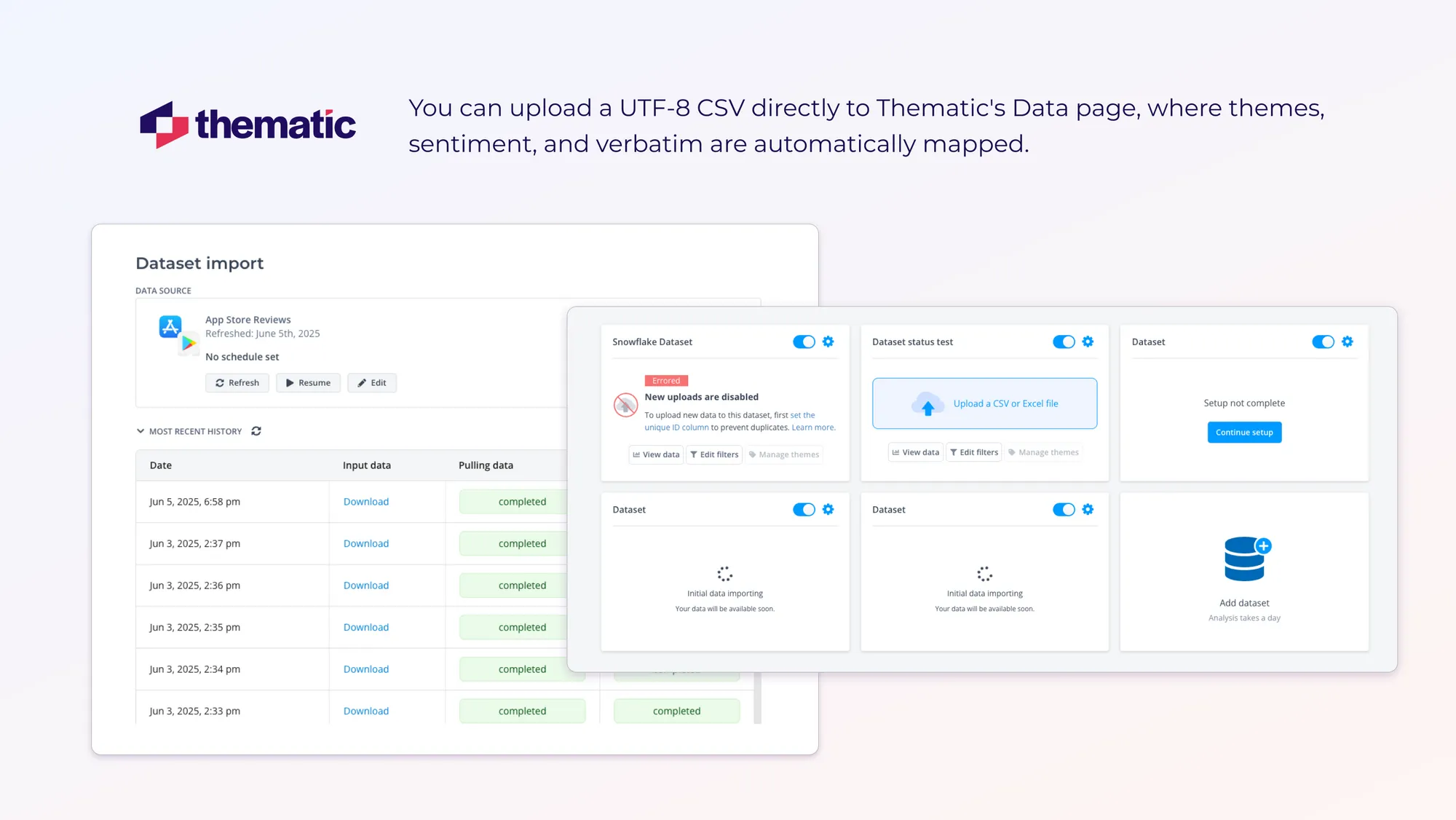
Step 2: Import the Dataset
Integrate your data sources with your feedback platform. AI pulls in new comments automatically.
For one-off pulls or niche channels:
Export data as UTF-8 CSV from your feedback source
Upload the file onto the platform’s Data page
Your Theme, Sentiment, and Verbatim should auto-map
Double-check for mystery nulls, and then you’re ready to chart.
Step 3: Build Your Core Charts
Start with three backbone visuals:
Top Themes by Volume widget
Impact (Positive & Negative Drivers) widget
Quote Carousel widget
Tip: Place them in a two-by-two grid (stats on top, stories below).
Step 4: Add Smart Interactivity
Enable filters so users can slice and drill. These could include:
Theme chips
Date slider
Click through to verbatim.
Good interactivity turns passive charts into active insight tools and makes them easy even for non-technical teams to use.
Step 5: Pilot, Polish, Publish
Sense check your pilot dashboard by sending the link to two teammates. Let them try it today, and collect friction notes tomorrow.
💡
Pro tip: Short on time? Thematic’s one‑click dashboard starter builds Steps 2–4 for you, and then hands you the wheel for final tweaks.
6 Common Qualitative Dashboard Mistakes (and How to Fix Them)
Not every dashboard is perfect the first time. Use this quick six-point check to fix the most common dashboard errors.
Pitfall
Fast Fix
Numbers drown out nuance
Pair the metric with one punchy customer quote
No guiding question
Write the key question before building any chart
Dashboard clutter
Show only visuals that answer that question
Quotes missing
Embed verbatim snippets for instant context
Data locked in one tool
Export via an open platform (e.g., Thematic)
Insights stay siloed
Auto-share a weekly digest to #cx-alerts
Conclusion: Insights That Actually Drive Change
The right qualitative dashboard turns chatter into direction. AI-generated summaries and simple bar charts show you the story behind the numbers.
In our next article, we’ll discuss how to derive insights from your shiny new dashboard. And how to present them to busy and important stakeholders so things actually change.
👉 Stay in the loop: Drop your email on our newsletter sign-up page, and we’ll be in touch the moment the article goes live.
Until then, pair every metric with a single customer line, keep your board in Slack, and let the client’s voice drive the next sprint.
👉 Skip the spreadsheets: Book a Thematic demo and launch your qual dashboard in minutes.
FAQs
How do I keep dashboards relevant when feedback volume is low?
When feedback is sparse, update dashboards monthly or quarterly to reflect meaningful trends. Include quotes to show context and depth. You can also group insights by theme, time, or customer type to ensure your dashboard still delivers value and stays relevant between data collection cycles.
What’s the best way to onboard new users to a qualitative dashboard?
Create a short walkthrough using real data. Show users how to filter by theme, view sample quotes, and interpret key charts. Emphasize how these features help answer real business questions, so new users clearly understand how to navigate and apply the dashboard in their role.
How can I measure the impact of dashboard-driven insights?
Track specific actions taken as a result of dashboard findings, then monitor key metrics like satisfaction, churn, or NPS over time. Collect feedback from internal teams to assess whether the insights helped guide decisions, resolve issues, or improve customer experience outcomes.
Can I automate the delivery of qualitative insights?
Yes. Use Thematic Workflows to schedule recurring insight reports or trigger updates when certain themes spike. You can customize routing by team or role, ensuring that stakeholders get timely, relevant feedback summaries without needing to log in and search through the dashboard manually.
Request a demo of Thematic's Customer Intelligence Platform
Thematic turns fragmented feedback into one consistent source of customer truth — so every team acts on the same customer story. Up and running in days, not quarters.
Thank you! Your submission has been received!
Oops! Something went wrong while submitting the form.


.webp)


.webp)